

Logo Design, Branding Guideline, Design System, Collaterals
Liquid Expat was the expatriate mortgage subsidiary of IP Global. It brokered mortgages for British expatriates buying property from abroad. My starting point was a pile of material with no common thread: contracts, invoices, letters, newsletters and advertising went out of several offices across the United Kingdom and Asia Pacific, and none of it shared a visual language or a rule anyone could follow.
The brief was never a logo, and I did not treat it as one. The company needed a system. It had to be distinctive enough to be recognized, and documented precisely enough that a broker in Manchester and a marketing manager in Hong Kong could produce consistent, on-brand material without design support. So I led the work from written positioning through to production artwork.
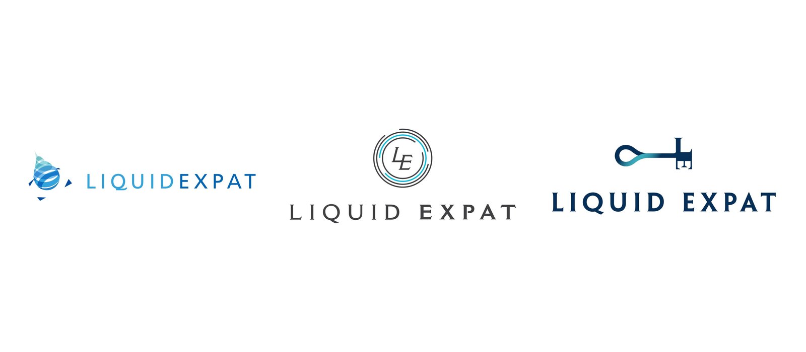
I presented three routes, each with a written rationale, so the client could choose a strategy rather than a picture
The route the client selected started from the globe and arrows on the concept board. I abstracted it so that global reach is built into the geometry rather than applied on top of it. The ripple carries the name Liquid and the idea of a business spreading outward.
Over four further rounds I closed the silhouette, moving it from an open drop into a continuous ring. I made that change because it solved three problems at once: the mark reproduced at small sizes, it worked without the name beside it, and it read as continuity rather than a falling droplet.
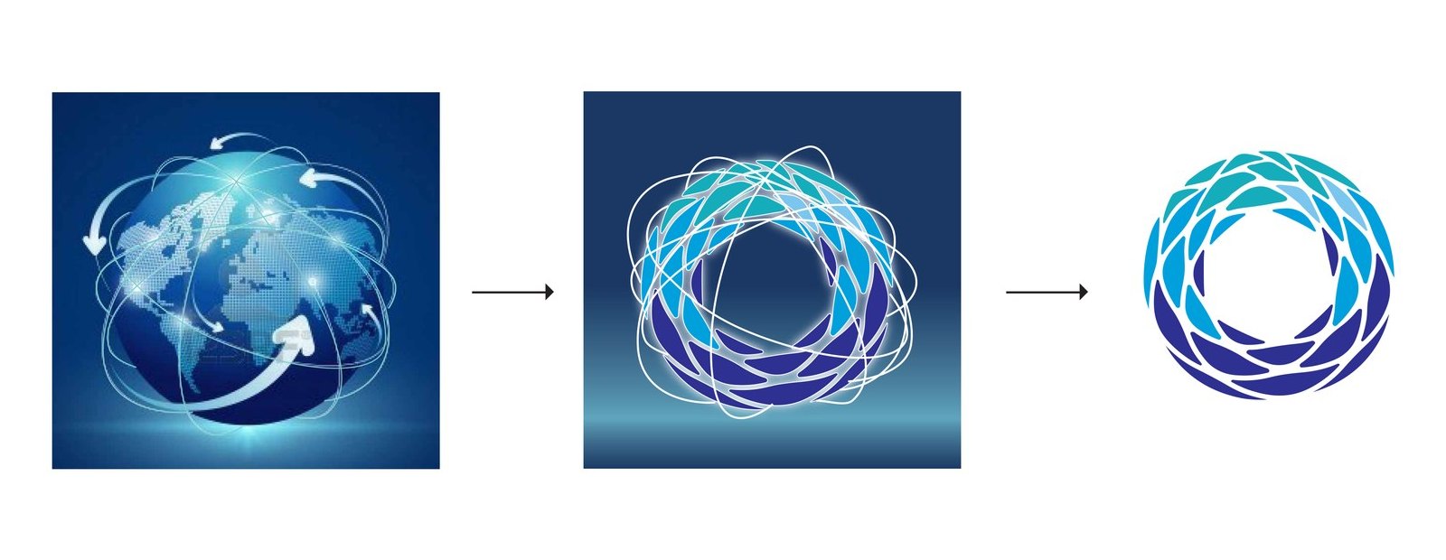
How I moved from globe and arrows, to ripples, to the resolved mark
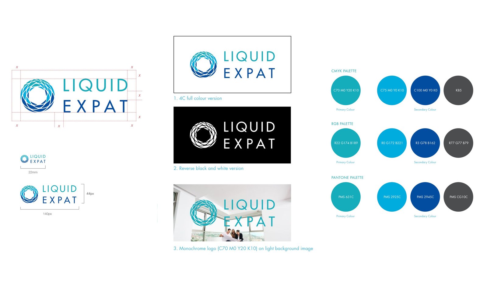
How I specified it: construction and clear space, three permitted variations, and one palette for press, screen and spot
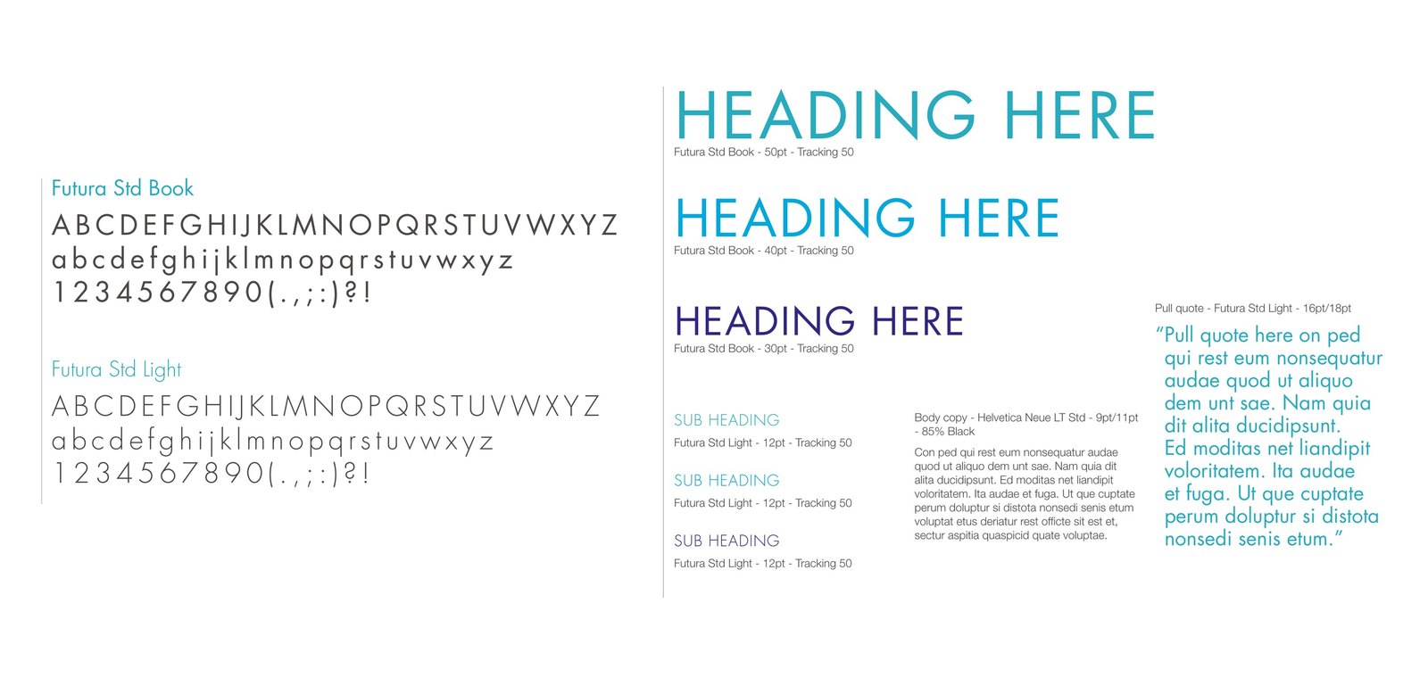
I used Futura Std for display, Helvetica Neue for reading, and Open Sans wherever Futura could not be served
I made sure every recurring document arrived pre-built. I took one magnified crop of the logomark and turned it into a watermark used at three strengths: pale tint, tone-on-tone and full color. That is why the system holds together without a second graphic device.
I shipped Word and PowerPoint templates alongside the print artwork. Internal documents are where brands quietly fall apart, because the people producing them do not have design software, so I treated those files as just as important as the brochure.
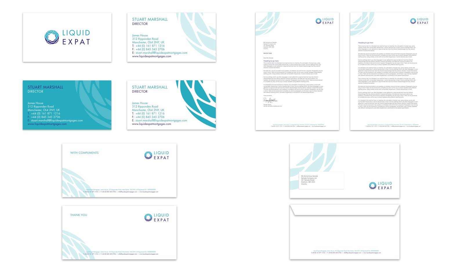
Stationery, where I set the watermark at three strengths
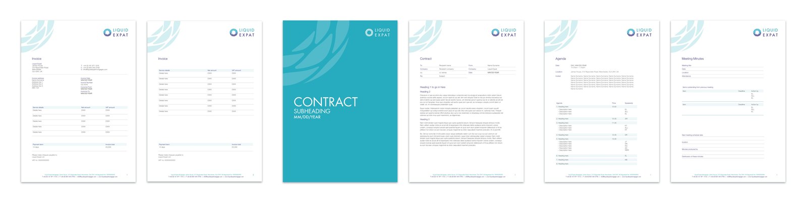
Financial, formal and internal documents, including native Word files
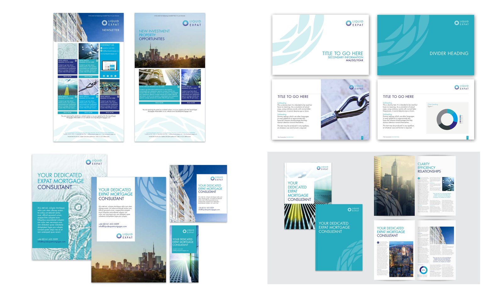
Campaign work. In the brochure, I used the three core values as the section headings
The office entrance was the hardest test the mark faced. Cut from brushed stainless, there is no color left to carry it and no gradient to hide behind, so the silhouette has to do all the work.
So I kept every leaf form a closed shape, bridged back to the body of the ring, which lets the whole plate cut from a single sheet. Closing the drop did not only solve small sizes and stand-alone use. It also made the mark manufacturable.
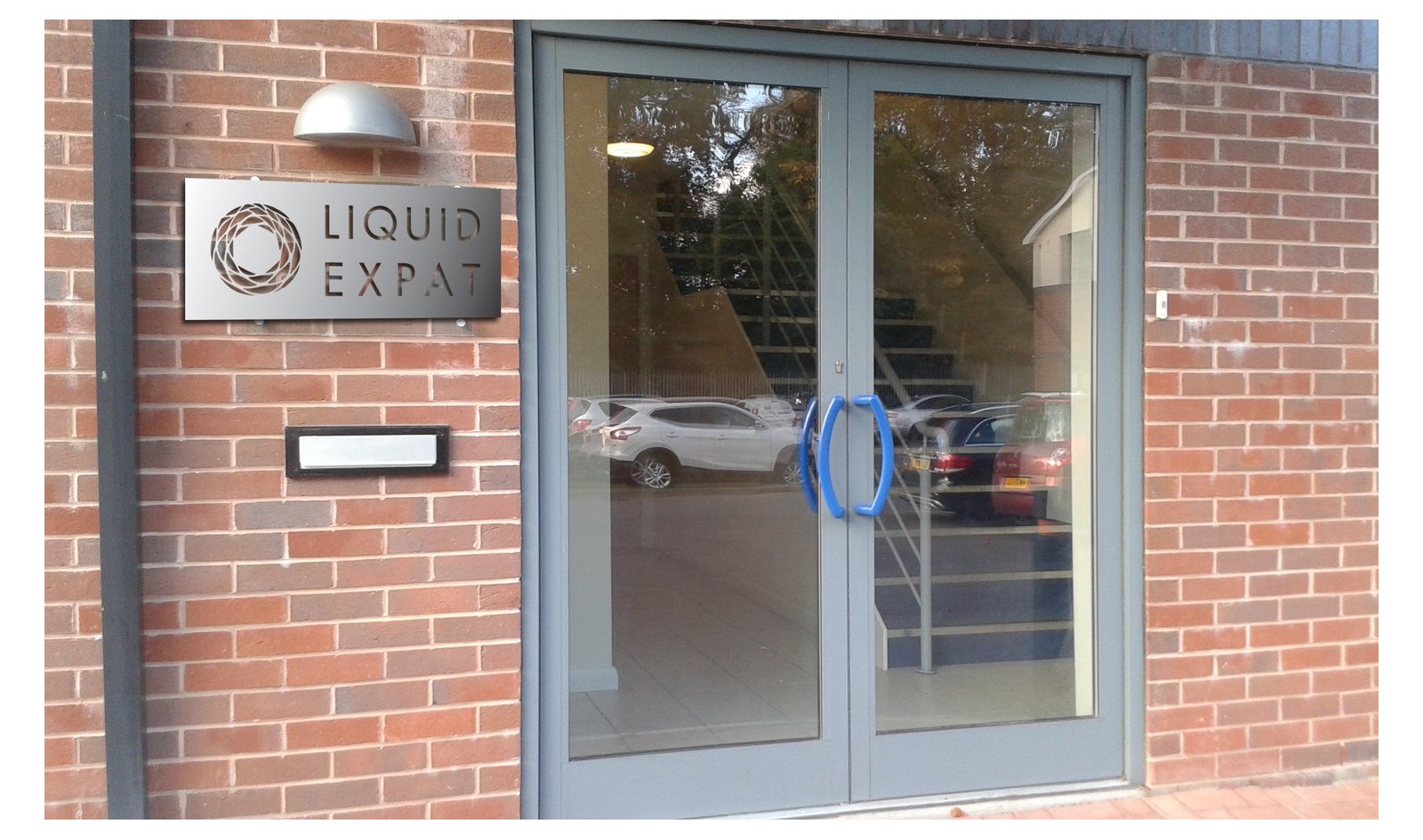
Manchester office, with the mark reduced to a single layer of silhouette