
Corporate identity system
Liquid ExpatBrand System
A corporate identity for a British expatriate mortgage broker: positioning turned into a mark, a specification manual, and fourteen production templates that people who are not designers could run without breaking.
Scroll, or use ↓ ↑ to move between plates. The index is top right.
The brief was never a logo.
Liquid Expat, the expatriate mortgage subsidiary of IP Global, brokered mortgages for British expatriates buying property from abroad. Contracts, invoices, letters, newsletters and advertising went out of several offices across the United Kingdom and Asia Pacific, and none of it shared a visual language or a rule anyone could follow.
What the company needed was a system: distinctive enough to be recognized, and documented precisely enough that a broker in Manchester and a marketing manager in Hong Kong would produce consistent, on-brand material without design support.
“The expat mortgage market is complex and ever-changing. Clients often find it difficult to access relevant, up-to-date information without facing a wall of words or a sea of jargon.” Liquid Expat brand strategy
Buying from a distance
Expatriate buyers commit to a large purchase in a country they do not live in, under underwriting criteria far stricter than a domestic applicant faces. Confusion is the starting condition, not the exception.
A sea of sameness
Mortgage brokerage defaults to navy, handshakes and stock skylines, so sounding trustworthy counts for nothing on its own. Being legible and distinct at once was the harder problem.
Many hands, no rules
Brokers, marketers and administrators across two regions were all producing client-facing documents. A system that needed a designer to apply it would have been dead within a quarter.
What the identity had to carry.
The written strategy came first, and every decision afterwards was measured against it: the mark, the palette, even the tint behind an invoice table header.
- Descriptor
- A full-service mortgage broker, focusing exclusively on the expatriate market.
- Proposition
- Value-added expat mortgages. Beyond the products themselves, that covers every stage of the lending experience: educating lenders and clients on market dynamics, clear information, balanced advice, cross-border currency transactions, and sourcing suitable investment property.
- Mission
- To redefine the expat lending experience, going beyond brokerage to offer a range of added-value services delivered with empathy and efficiency.
“We believe in bringing clarity out of confusion. Our upfront, straightforward style means you can readily access the information and advice you need to feel confident in your lending decisions.”
In the design: generous white space, one message per surface, and a body face specified light so that text never crowds.
“Our expertise gives our clients a headstart in knowing what paperwork is required and our prompt, proactive style helps take the pain out of the process.”
In the design: templates instead of layouts. Every recurring document arrived pre-built, so producing one takes minutes.

“We are committed to achieving mutual benefit in all of our relationships, whether lenders or clients. If you need us, we will be here.”
In the design: the interlocking swirl of the logomark, and one continuous gradation from turquoise to deep blue rather than three separate flat colors.
Each value was assigned a visual consequence, which is why the three of them later became the section headings of the brochure.
Personality
How the company behaves, which in turn set how the brand was allowed to look and sound.
Straightforward
“Every client and every situation is different. We are realists not idealists so, if we can help, we will give our clients all the information they need and as much advice as they want. We do not believe in wasting anyone’s time.”
Insightful
“We know our market inside and out but, critically, we also know how to apply that knowledge so that our lenders and clients can make the market work best for them.”
Proactive
“We take the lead, educating lenders to drive market supply and educating clients as to how the market works. We think ahead, identifying challenges before they become problems.”
Tone of voice, color-coded.
Three rules govern every communication with colleagues, clients, partners or press. In the manual each one is set in a different brand color, so the voice and the palette teach each other.
Direct
Use clear, short statements. Avoid unnecessary jargon and, where necessary, explain it. Get to the point, without being abrupt.
Typographic consequence: the headline rule caps display type at two or three words per line, so a headline that will not fit the pattern is a headline that is too long.
Empathetic
Listen first, acknowledge and repeat client and lender requirements, explain why the response or advice is appropriate, and never patronize, stereotype or jump to conclusions.
Typographic consequence: body copy is specified at 85% black rather than solid, and set light, which keeps long explanations approachable.
Convincing
Be relevant, professional and persuasive. Know what you are talking about, do your homework beforehand, and stay enthusiastic without waffling.
Typographic consequence: one accent color carries emphasis, which keeps highlighting rare enough to still mean something.
One system, from the underwriting desk to a private investor overseas.
That distance set the range the system had to cover: formal regulated documents at one end, warm campaign material at the other, recognizably the same company at both.
Lenders
Major banks and smaller boutique building societies, looking for revenue opportunities, wanting to minimize risk through quality clients, and valuing long relationships. Many arrive with no prior experience of the expatriate market at all.
What they touch: contracts, invoices, letterheads, meeting minutes, agendas. Correct, precise, unmistakably a regulated business.
Clients
Private property investors living abroad, often frustrated by a lack of information and sometimes resentful at being required to use a broker at all. They want access to the best products and rates, simple efficiency, and empathetic personal service pitched at the standard a high-net-worth client expects.
What they touch: newsletters, adverts, the brochure, the website, email. Open, photographic, plain-spoken.
Part one
The identity
Three opening concepts narrowed to one specified mark, then construction, clear space, minimum sizes, permitted variations, prohibited use, color across three reproduction systems, typography for print and screen, and the rules for the logomark standing alone.
Three routes to the same promise.
Each route read the name and the proposition differently, and each was presented with a written rationale so the client was choosing a strategy rather than a picture.
Water drop

A water drop for a dynamic service approach, wrapped in a non-stop swirling pattern that stands for the one-stop global relationship. The individual shapes read as arrows, which carry the idea of services going beyond the normal stages.
Ripple and stamp chop
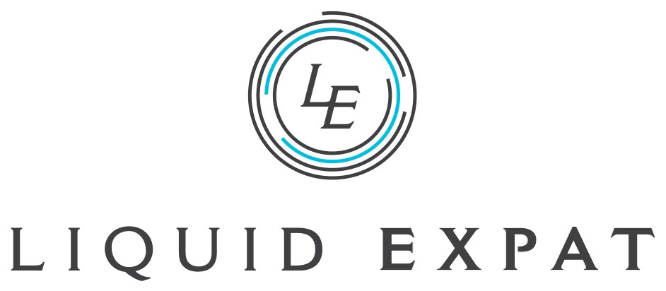
Concentric ripples doubling as a stamp chop, since a chop carries approval, endorsement and security. A serif letterform puts the whole thing in a classic corporate register.
Key to opportunities
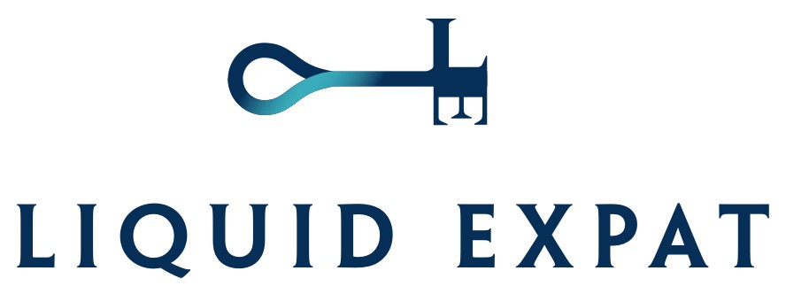
The initials L and E cut into the bit of a key, where the key stands for opening up investment opportunities. Two overlapping curves form the bow, and the overlap itself is the bond between company and client.
Route A, developed into the final mark.
The mark is abstracted from the globe and arrows on the concept board, so global reach is built into the geometry rather than applied on top of it. The ripple carries the name Liquid and the idea of a business spreading outward, and the contemporary treatment was chosen to earn recognition quickly.

Across four further rounds the silhouette closed from an open drop into a complete ring, and that single structural change solved three problems at once: it reproduced at small sizes, it worked without the name beside it, and it read as continuity rather than a single falling droplet.
Development notes and rationale as written for the client presentation.
- The water drop associates with the dynamic service approach of the company.
- The non-stop swirling pattern resembles a one-stop solution for building strong global client relationships.
- The arrow shapes represent services that go beyond the normal stages of brokerage.
- The gradation from turquoise to blue symbolizes trust, loyalty and intelligence through the lending process.
- A sans serif typeface adds a modern touch to the whole logo.
- Overall: connected, dynamic, modern, bespoke.
The brand signature.
Logomark and wordmark, locked together. “The Liquid Expat logo should always be used as supplied, in the correct colors and should never be recreated or altered. Any deviation from the specified guidelines will undermine the status of the brand.”
- Logomark
- A closed ring of overlapping leaf and arrow forms, graduating from Liquid Turquoise at the top to Liquid Dark Blue at the base.
- Wordmark
- Futura Std, capitals, set on two lines with wide letterspacing. LIQUID in turquoise, EXPAT in dark blue, so the gradation runs the same direction in both elements.
- Lockup
- Mark left, wordmark right. The wordmark is optically centered on the mark rather than aligned to its bounding box.
One unit, and everything measured from it.
The manual defines a single unit, x, then derives the gap between mark and wordmark, the leading between the two wordmark lines, and the exclusion zone on all four sides from it. Anyone rebuilding the lockup arrives at the same result.
- Clear space
- x on every side, measured from the outer edge of the mark and the cap height of the wordmark. Nothing else may enter that zone.
- Min. print
- 22 mm wide. Below that, the overlapping forms inside the ring begin to fill in on press.
- Min. screen
- 140 × 44 px, sized for the website header and for email signature blocks.
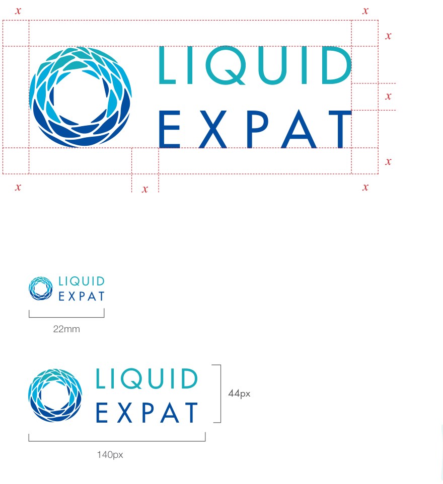
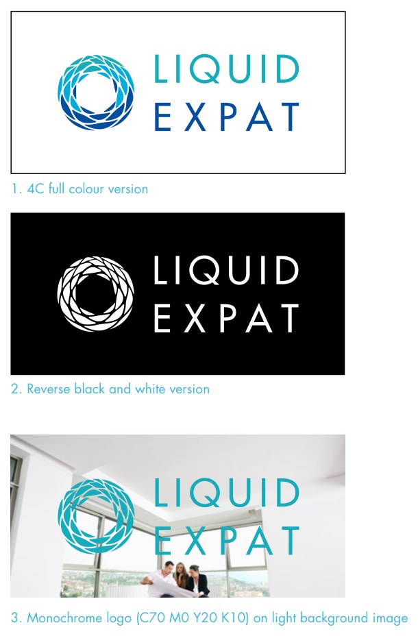
Three variations, and nothing else.
Keeping the set small is what holds a distributed team together, because for any given background there is exactly one right answer and no menu to browse.
- Four-color. The full color version, for white and light color grounds. This is the default.
- Reverse. The white logo, for dark color grounds or where a special printing effect such as foil or spot varnish is applied.
- Monochrome. Primary C70 M0 Y20 K10 applied flat, for placement over a light background image.
Every variant here exists because a real production situation demanded it.
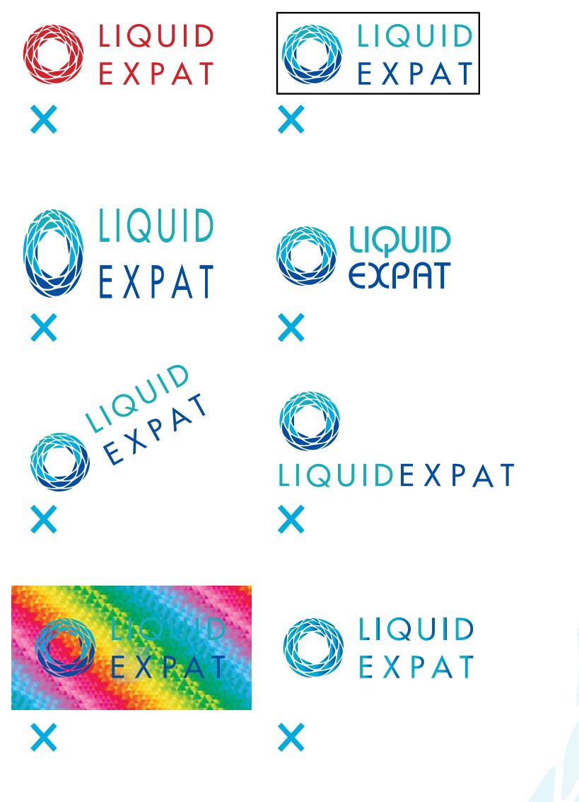
What the manual prohibits.
A logo file loose inside an organization will be misused in more ways than any manual can anticipate, so these eight name the failures that actually recur. Showing the wrong version beside a cross lands faster than a paragraph asking people to be careful.
- Do not use alternate colors of logo.
- Do not place the logo in a containment field.
- Do not skew or stretch the logo.
- Do not re-typeset the logo.
- Do not display the logo in a tilted position.
- Do not move logo elements.
- Do not apply the full color logo to a colorful background or pattern.
- Do not apply any filters or effects to the logo.
Four colors, specified four ways.
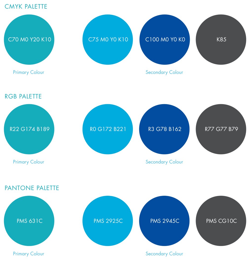
Each color is given in CMYK for litho, RGB and hex for screen, and Pantone for spot work and fabrication. Specifying one color four ways is what stops a printed business card drifting away from the website, and it is what let a sign maker quote the job without ever opening the artwork.
| Swatch | Name | Role | CMYK | RGB | Pantone | Hex |
|---|---|---|---|---|---|---|
| Liquid Turquoise | Primary | C70 M0 Y20 K10 | R22 G174 B189 | 631C | #29ABBF | |
| Liquid Cyan | Secondary | C75 M0 Y0 K10 | R0 G172 B221 | 2925C | #00A9DB | |
| Liquid Dark Blue | Secondary | C100 M100 Y0 K0 | R49 G39 B131 | 2746C | #312783 | |
| Liquid Grey | Body copy | C0 M0 Y0 K85 | R77 G77 B79 | CG10C | #4A4A49 |
Tints do the quiet work
Every color carries a specified tint ladder from 90% down to 10%, and the manual names one of them outright: 20% turquoise is used on all the stationery. That single value is the watermark, the invoice table header and the tone-on-tone flood, which is why the whole system holds together without a second graphic device.
Tint ladder redrawn from the specified percentages of Liquid Turquoise.
Two faces for print, one for screen.
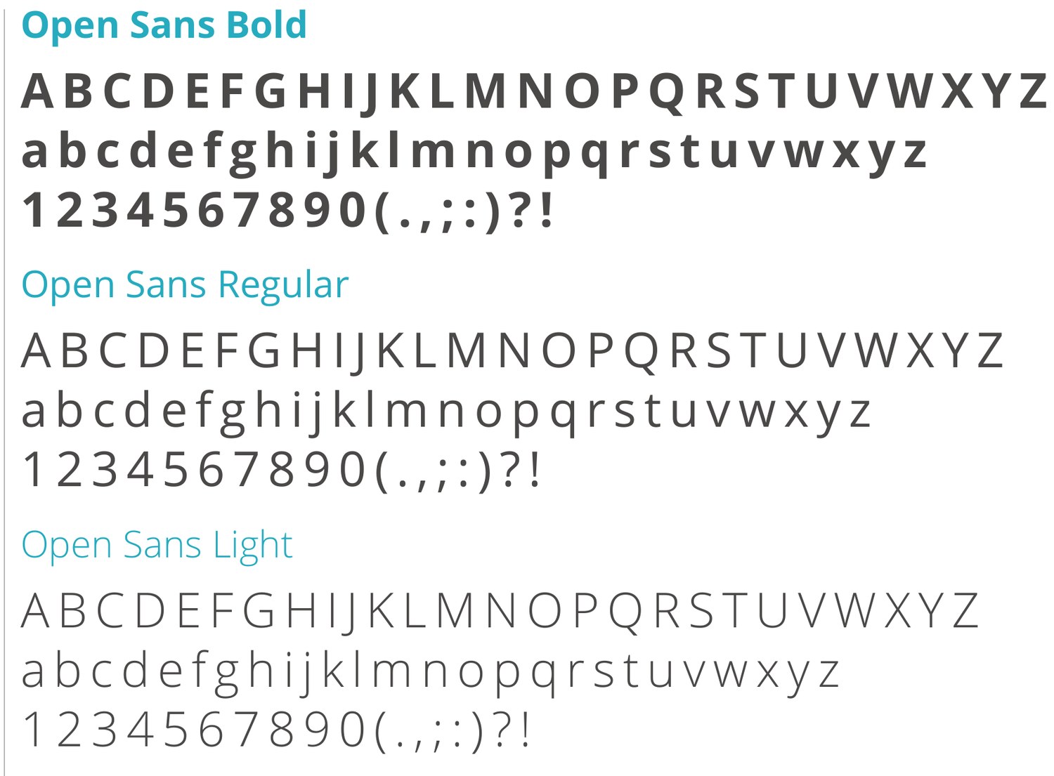
The manual splits type by where it will be reproduced rather than by what it looks like, which is why the system never argues with itself: Futura Std carries the brand voice in print, Helvetica Neue LT Pro carries the reading, and Open Sans takes over anywhere Futura cannot be licensed or served.
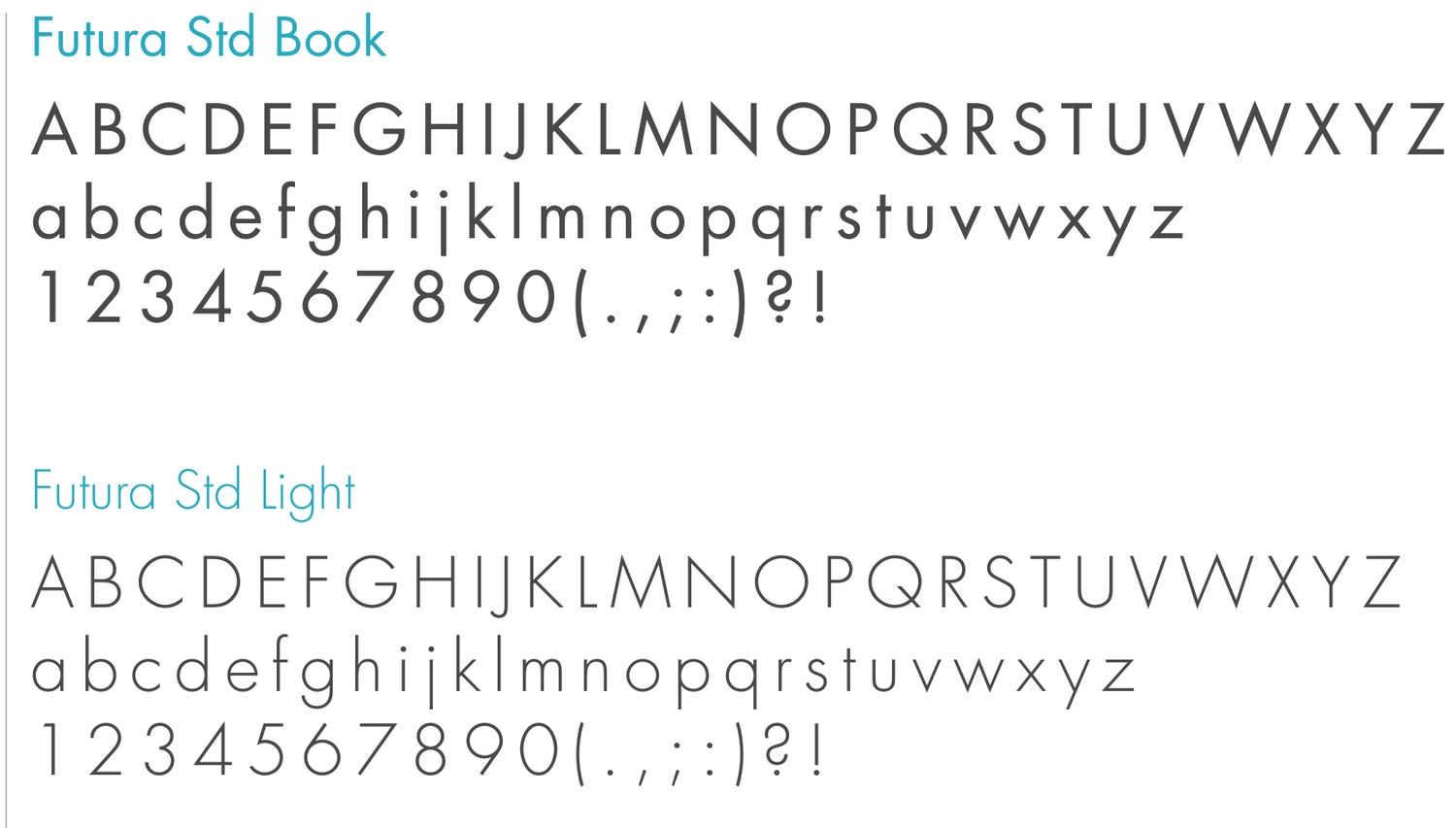
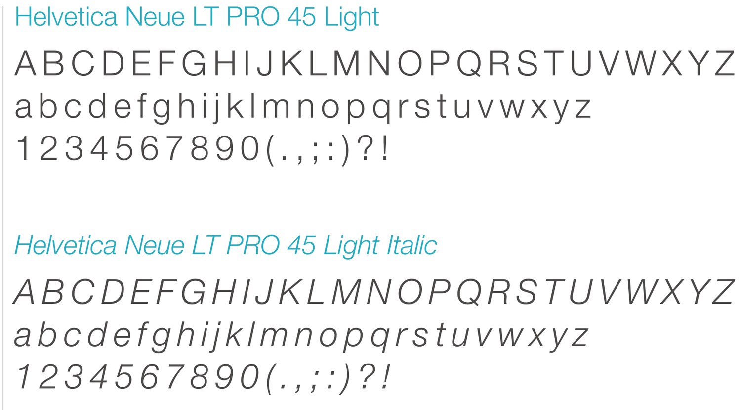
Specimens reproduced from the guidelines. Both families are licensed print fonts, so they are shown as artwork rather than set as live text.
Bringing it all together.
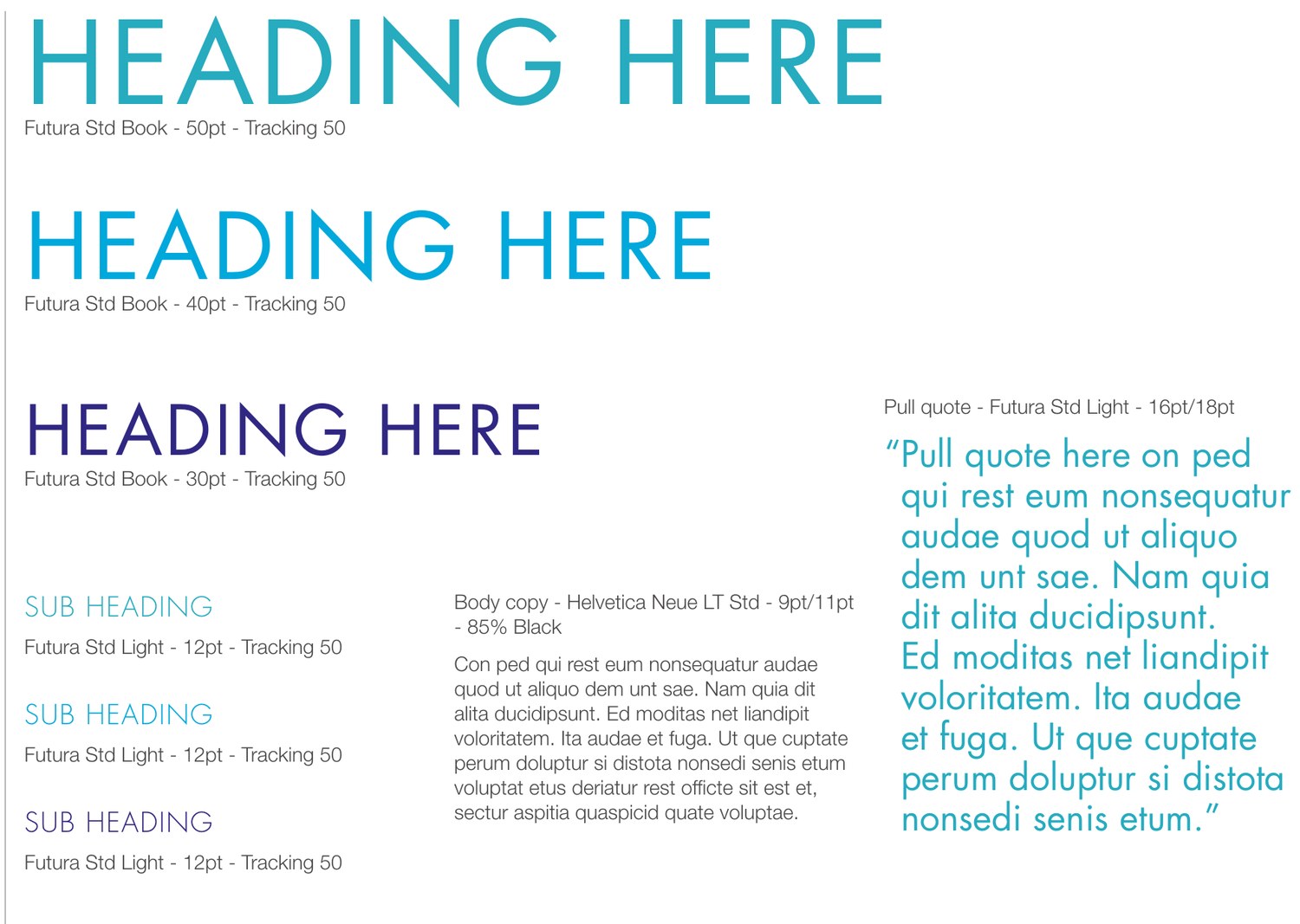
The scale does more work than anything else in the system, because it makes a headline look designed without anyone having to design one.
Tracking of 50 thousandths of an em appears on every heading level, which is the single value that makes Liquid Expat typography recognizable at a glance.
- Headings
- Futura Std Book at 50 / 40 / 30 pt, tracking 50.
- Two words
- Drop the last word to the next line.
- Three or more
- Keep the second-to-last word in turquoise and drop the final word to the next line in dark blue.
- Subheads
- Futura Std Light 12 pt, tracking 50.
- Body copy
- Helvetica Neue LT Std 9 / 11 pt at 85% black.
- Pull quote
- Futura Std Light 16 / 18 pt.
Open Sans, wherever Futura cannot go.
“For digital collated and online, where Futura is not available, use Open Sans.” Three weights are specified, and what carries across from print is the structure rather than the letterforms.
abcdefghijklm
1234567890
abcdefghijklm
1234567890
abcdefghijklm
1234567890
These three specimens are live text, set in the specified weights of Open Sans. This case study is a digital application of the brand, so every word of it follows the same rule.
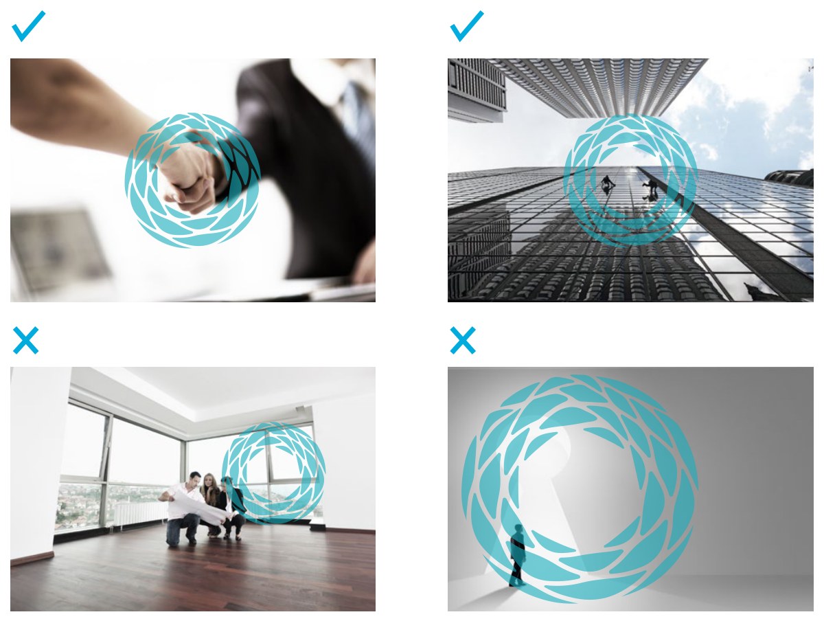
The mark, on its own.
“Logomark is the essential element for our brand. It can be a stand-alone identity without the company’s name.” Closing the drop into a ring is what made that claim true.
- Position
- Always centered in the image.
- Opacity
- Slightly transparent, so the photograph reads through the mark.
- Scale
- Never so small that it is lost, never so large that it overwhelms the image.
- Intent
- The logomark should highlight the most important message in the image.
Photography, reduced to three subjects.
The imagery brief names three categories and stops there. A short list is a usable list, because someone briefing a picture search gets a decision rule instead of a mood. Notice that the three categories restate the core values, so the photographic brief and the brand strategy are the same document, which is why the pictures never drift.




Part two
The collateral
Fourteen templates covering every surface the company produced, from the email signature a broker sends forty times a day to the eight-page brochure, each delivered as artwork plus an editable template so the system could run without a designer.
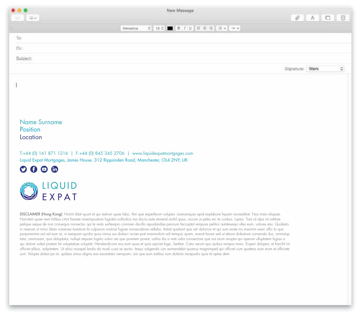
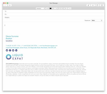
Email signature
The highest-frequency brand touchpoint in the company, and the one most likely to be rebuilt badly by every new starter.
- Built as
- Live text in brand colors rather than an image, so it survives image blocking and renders in any mail client.
- Hierarchy
- Name in turquoise, position in dark blue, location in gray, with contact details in a single accent weight.
- Regional
- A jurisdictional disclaimer slot, shown here for Hong Kong, so each office appends its own legal text without touching the layout.
Business card
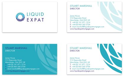
Four faces, and the piece where the watermark device got settled. One magnified crop of the logomark appears at three strengths here: pale tint, tone-on-tone, and full primary. That range then governs every other piece in the system.
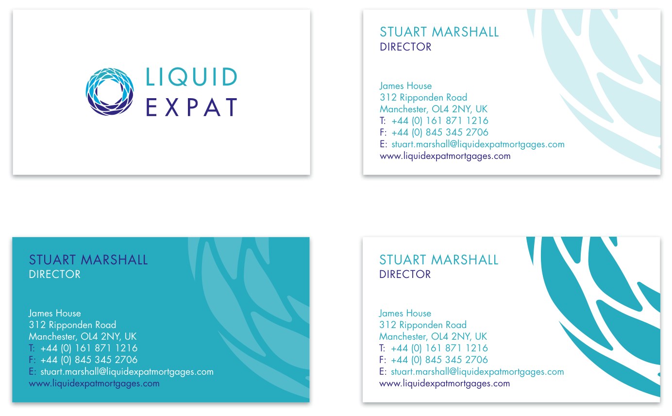
- Device
- The watermark is a magnified crop of the logomark, bled off the right edge and never shown complete, so it reads as texture rather than a second logo.
- Typography
- Name in Futura capitals, tracked. Position beneath in dark blue. Contact details in the specified gray with turquoise labels.
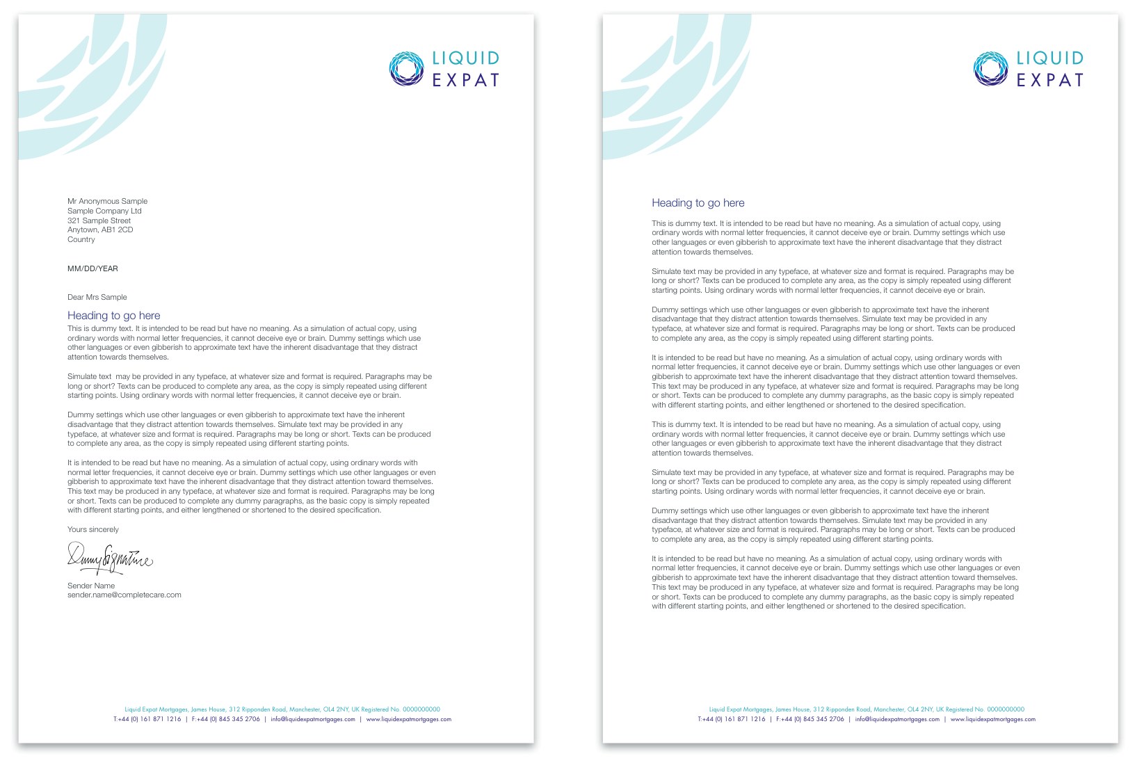
Letterhead and continuation
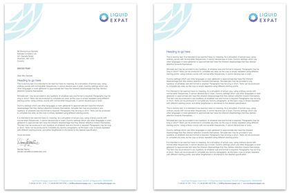
Specifying the continuation sheet is what separates a system from a logo drop, because a three-page letter that falls onto plain paper after page one reads as an unfinished company.
- Furniture
- Watermark top left, logo top right, registered-company footer across the base, identical on both sheets.
- Difference
- Only the addressee block and date drop away on the continuation sheet. Everything else holds position.
- Headings
- Sentence-case headings in turquoise, body in gray, matching the print type rules exactly.
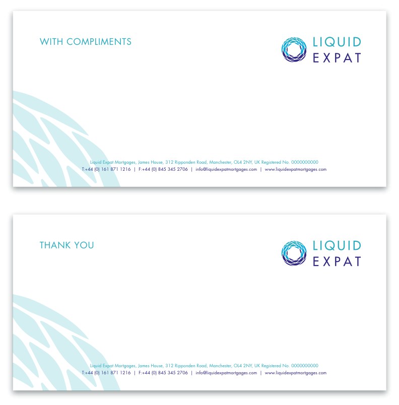
Compliment slip
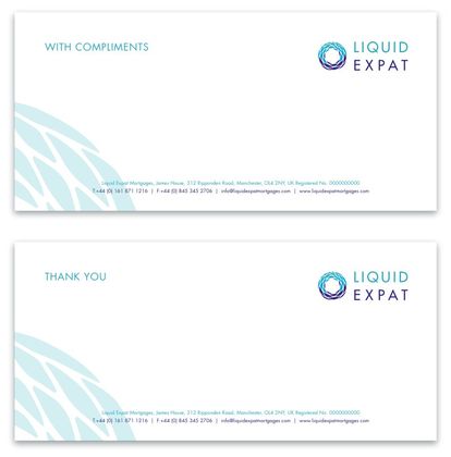
A small piece that earns its place by carrying tone. Offering “thank you” as an alternative to “with compliments” is the empathetic voice rule made physical.
- Format
- DL landscape, sized to sit inside the standard envelope without a second fold.
- Watermark
- Rotated to rise from the lower left, clearing both the footer rule and the writing area.
- Salutation
- Turquoise capitals at top left, balancing the logo at top right.
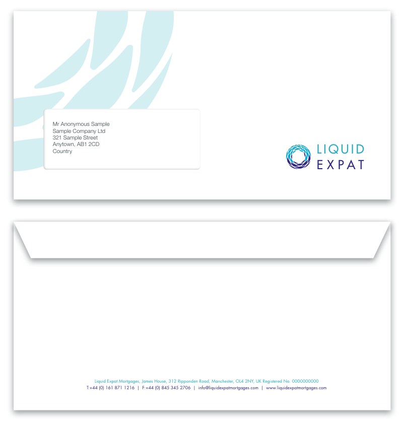
Envelope
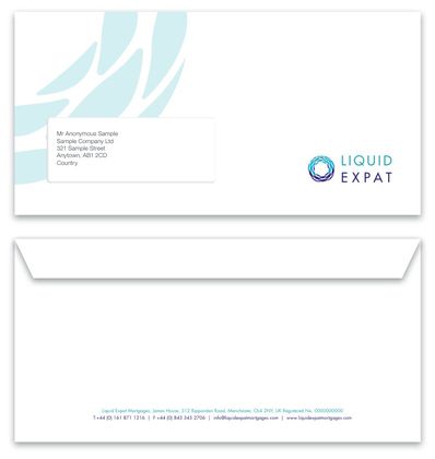
The one piece where a graphic decision can stop the post being delivered, so the watermark is cropped and placed to leave the address window and its required clear zone completely empty.
- Format
- DL window envelope, taking the letterhead folded to thirds.
- Front
- Watermark upper left, logo lower right, window clear.
- Reverse
- Registered-company line and contact details only, centered above the flap seam.
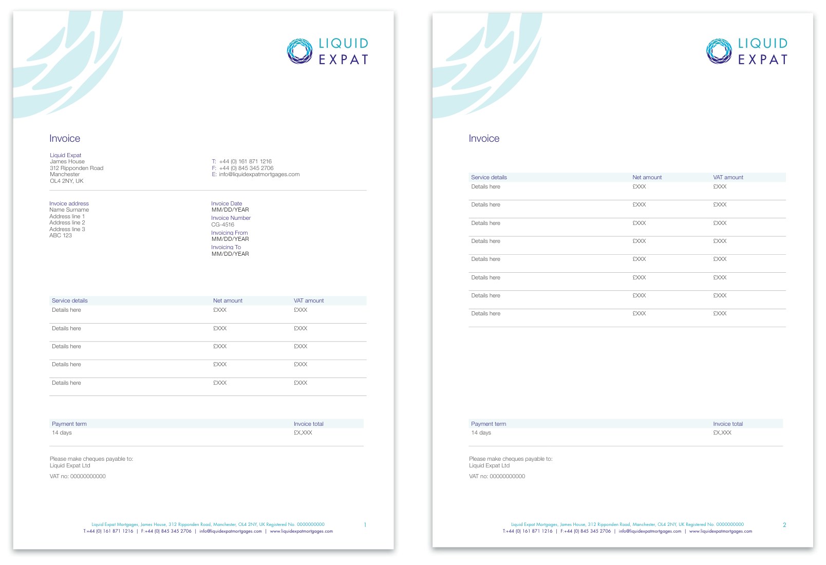
Invoice and continuation
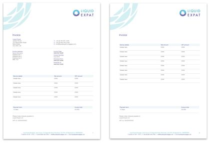
A financial document has to stay scannable under audit, so this piece is mostly information design: consistent column widths, a tinted header band, and hairline rules between rows instead of a boxed grid.
- Table
- Header band in 20% turquoise, column labels in turquoise, values in gray, rows divided by hairlines only.
- Totals
- Payment term and invoice total sit in a second tinted band, held apart from the line items.
- Continuation
- Page two repeats the header band and carries its own page number, so a detached sheet still reads.
Contract
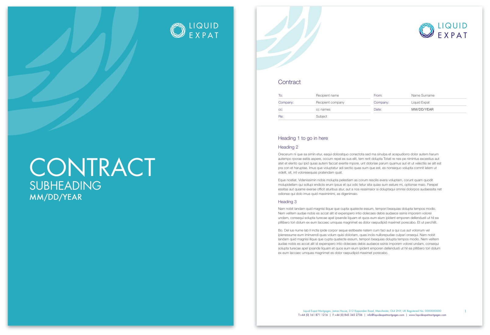
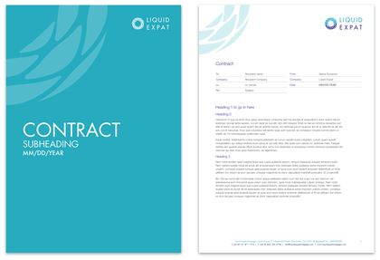
The most formal thing the company sends, and the piece that proves the reverse logo variant was a working requirement rather than a decoration.
- Cover
- Full turquoise flood, tone-on-tone watermark, reversed white logo top right, title in Futura Light capitals at the foot with subheading and date.
- Interior
- White, opening on a To and From routing table in hairline rules, then three levels of numbered heading in turquoise and dark blue.
- Reuse
- The same cover and interior construction carries the proposal and report templates.
Word document templates
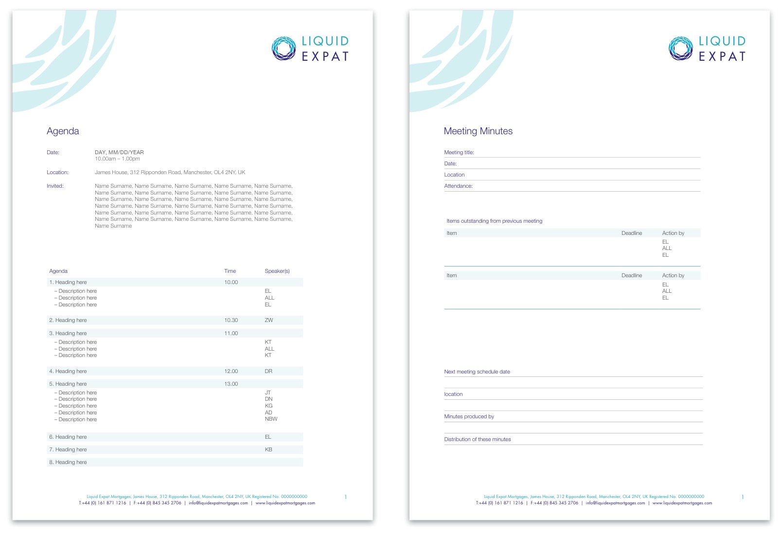
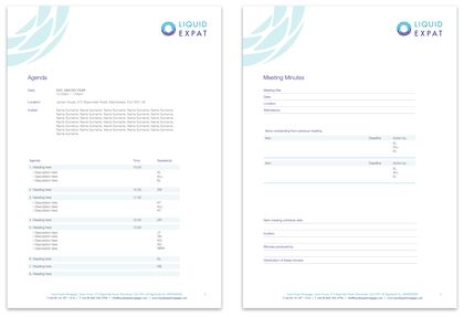
The least glamorous item in the system, and arguably the most important. Internal documents are where brands quietly fall apart, because the people producing them do not have design software.
- Format
- Native Word files with the header and footer furniture locked, so the brand survives editing.
- Agenda
- Timed rows with speaker initials and alternating tint bands, which keeps a long list legible.
- Minutes
- Ruled entry fields for attendance, outstanding items, deadlines, actions and distribution.
- Furniture
- Identical watermark, logo and footer to the letterhead, so an internal note and a client letter read as the same company.
eDM templates
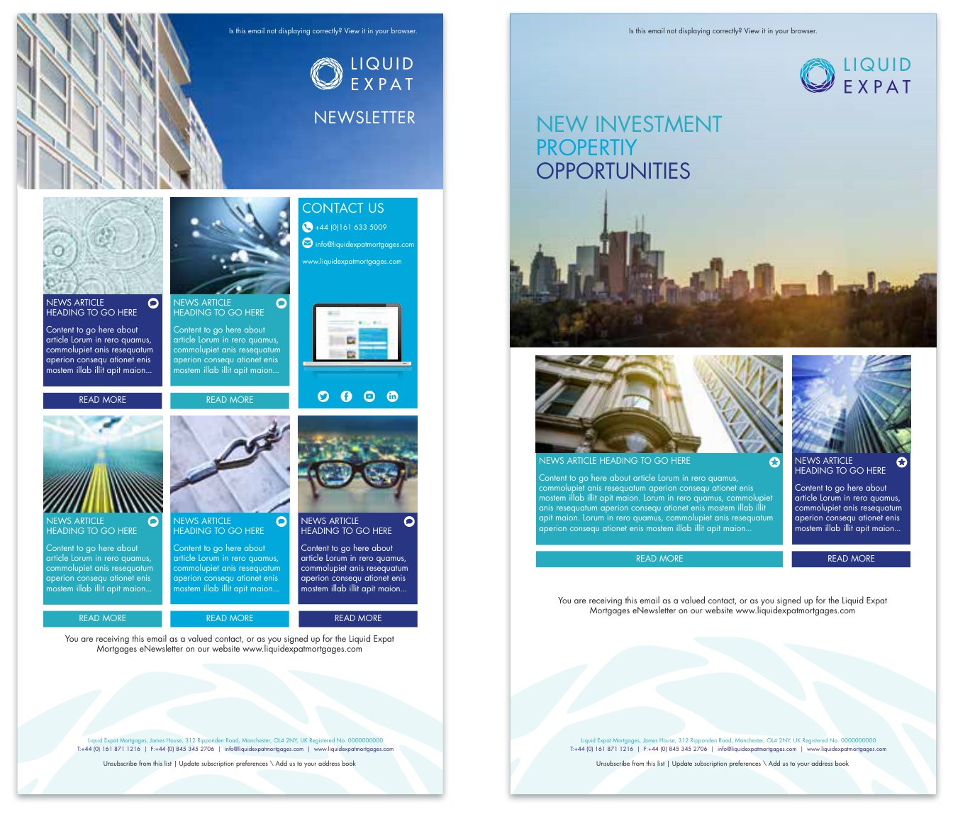
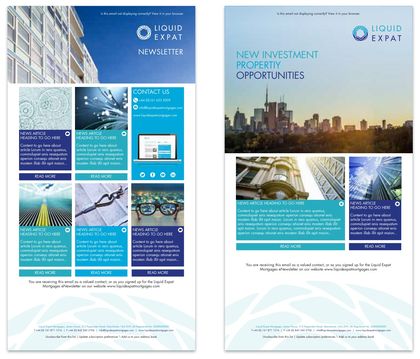
A modular card grid rather than two fixed designs, which let the marketing team run a six-story newsletter or a two-story announcement without commissioning new artwork either time.
- Structure
- Header image band, then cards at three-up or two-up, each card carrying image, heading, standfirst and a read-more button.
- Color coding
- Card captions alternate between dark blue and turquoise, separating adjacent stories without adding rules or boxes.
- Furniture
- Turquoise contact panel with social icons, and a watermarked footer carrying the subscription and unsubscribe lines.
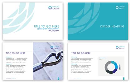
Presentation template
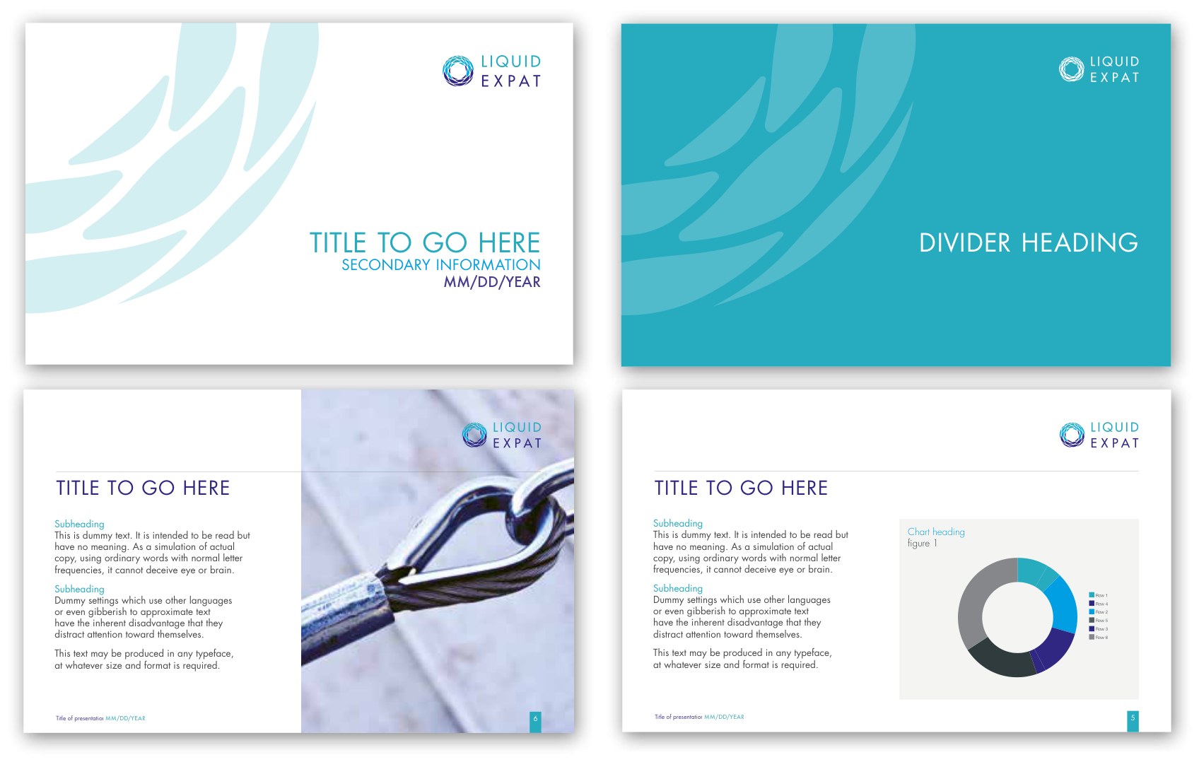
Four masters covering the shapes a real deck actually takes: a title, a chapter break, text with an image, and text with a chart. The chart palette is drawn from the brand colors plus two grays, so a data slide cannot introduce a new color by accident.
- Rhythm
- White content pages broken by turquoise flood dividers, the same alternation the manual uses on itself.
- Furniture
- Logo top right on every master, running footer with presentation title and date, page number in a turquoise tab at the lower right.
Office signage, external
Two treatments so the sign works against either a light or a dark building. Signage is where the Pantone specification earns its keep, because a fabricator needs a spot reference to match, not a screen value.

- Light ground
- Four-color logo with the watermark at tint strength.
- Dark ground
- PMS 631C flood with the reverse white logo and a tone-on-tone watermark.
- Scale
- The watermark enlarges far past its print size, which the mark tolerates because it is built from flat vector shapes with no gradient mesh anywhere in it.
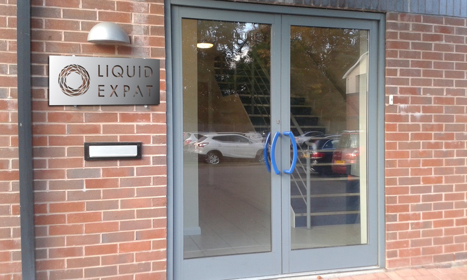
Exterior signage
- Material
- Brushed stainless plate, logo cut through, stood off the brick on barrel fixings so the wall reads through the mark.
- Design execution
- Stripped to a single layer of silhouette, with no color and no gradient left to carry it, the mark reads considerably more high-end and sleek. Every leaf form stays a closed shape bridged back to the body, so the whole plate cuts cleanly from one sheet.
Office signage, internal
One lockup, repeatable for any room in any office: logo, a turquoise vertical rule, then the room name in Futura capitals. New room, same artwork, new words.

- Lockup
- Logo, vertical turquoise rule, room name. The rule guarantees the clear space around the logo is never violated by the room name.
- Wrapping
- Room names longer than one word stack onto two lines and stay left-aligned to the rule.
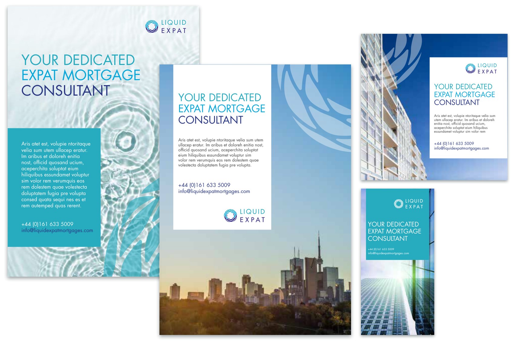
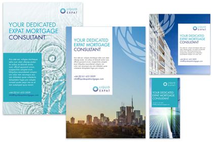
Adverts and online banners
One headline across four aspect ratios. “Your dedicated expat mortgage consultant” is the tone rules working as copy: direct, short, jargon-free, and it breaks cleanly across three lines under the headline typography rule.
- Formats
- A4 portrait for print, plus landscape, half-page and skyscraper units for display.
- Copy block
- A solid turquoise panel or a white panel depending on the photograph, always carrying headline, short paragraph, phone and email.
- Imagery
- Drawn from the approved photographic categories, never sourced ad hoc.
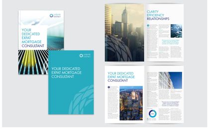
Brochure
The piece that closes the loop. Its interior section headings are Clarity, Efficiency, Relationships, so the three core values arrive as the actual navigation of the company’s main sales document.
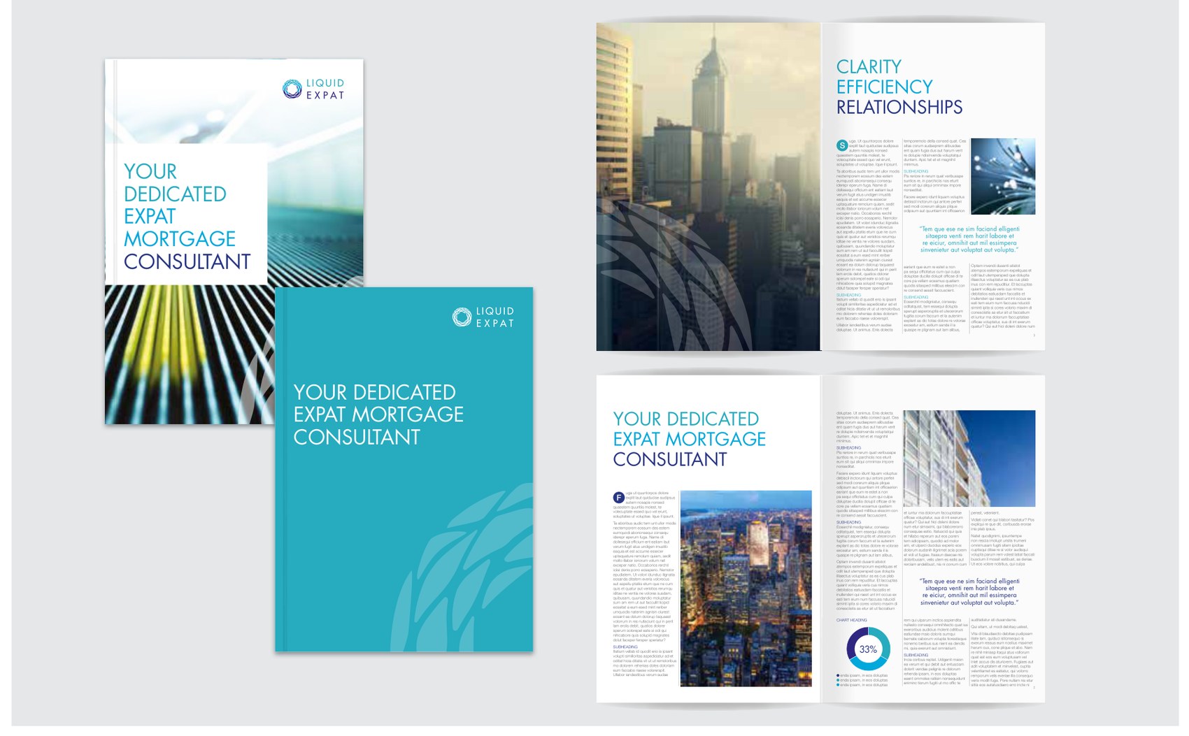
- Covers
- Two routes, image-led with a white copy panel or a turquoise flood with a tone-on-tone watermark, both carrying the same headline.
- Interior
- Full-bleed photography facing a text page, with a turquoise drop capital, pull quotes in Futura Light, and charts drawn from the brand palette.
- Headings
- Set under the print headline rule, so the last word drops to a new line in dark blue.
Fourteen templates, one language.
Consistency is doing the work here: one watermark at three strengths, one two-color typographic break, one set of footer furniture, and a single palette specified for press, screen and spot.


The decisions that still look right were the operational ones.
Looking back at the system, what aged well had almost nothing to do with taste.
Closing the mark
Turning the open drop into a closed ring let the logomark work alone, scale to a building, sit centered over a photograph, and cut cleanly from metal. One structural decision unlocked four applications.
One device, three strengths
Deriving the watermark from the logomark instead of drawing a separate pattern meant there was never a second thing to police. Tint, tone-on-tone and full strength covered every ground the brand ever landed on.
Shipping the Word files
Delivering native Word and PowerPoint templates alongside the print artwork is why internal documents stayed on brand. Artwork that only opens in InDesign is useless to the people who produce most of a company’s documents.
The screen tier was a substitution, not a system
Naming Open Sans as the Futura stand-in solved a licensing problem, but it left print and screen speaking in slightly different voices. That tier belongs in a properly licensed web font, with the tracking and headline rules carried across as design tokens rather than as written instructions.
Two documents, one brand
The system went out as a print-led manual and a separate collateral document, which is one document too many for anyone who just needs to make a letterhead. A single source, versioned, with the artwork linked from the page that specifies it, would have saved every one of the questions that came back.
Liquid Expat
Corporate identity and collateral system.
Positioning translated into a mark, a full specification manual, and fourteen production templates across print, screen, document and environment.
PDF Read the full brand guidelines 29 pages · 1.3 MB · opens in a new tab- Designer
- Emily Lam
- Role
- Brand design lead. Concept development, logo design, identity specification, manual art direction and layout, and all collateral artwork.
- Client
- Liquid Expat Mortgages, Manchester, United Kingdom. A subsidiary of IP Global.
- Parent company
- IP Global