
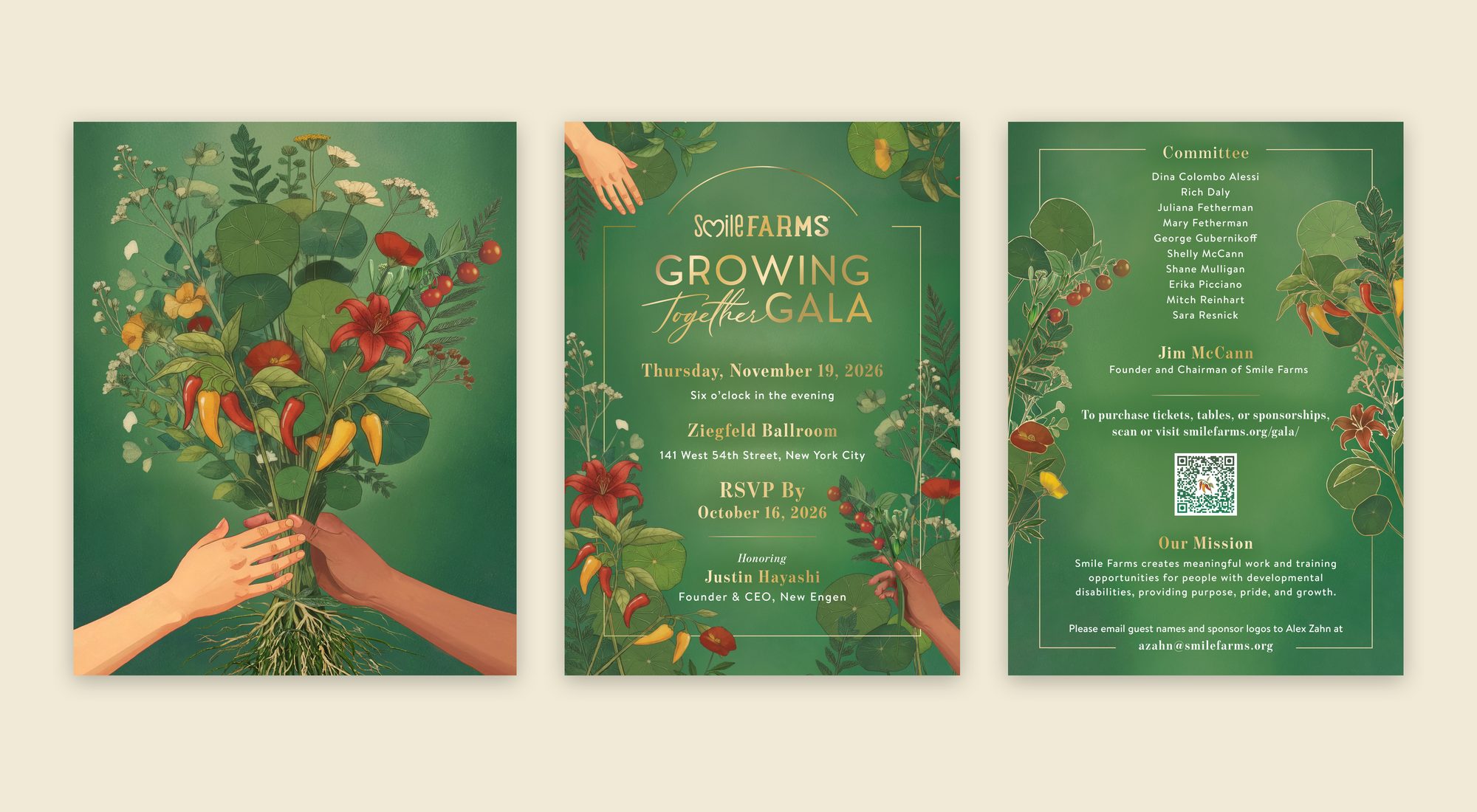
I designed the 2026 campaign for the Growing Together Gala, the annual fundraiser for Smile Farms. Smile Farms creates meaningful work and training opportunities for people with developmental disabilities. The gala, held at the Ziegfeld Ballroom in New York City and honoring Justin Hayashi, Founder & CEO of New Engen, is the organization’s biggest fundraising night of the year.
For 2026, the team wanted the gala to feel more elevated than past years without losing the farm. Earlier years leaned on watercolor foliage and wedding-style type, and the event planner was pointing me to classic New York charity balls.
Three constraints shaped everything I did. Past brainstorms had gone in every direction, so the board needed clear style lanes to react to, not a blank page. A small in-house team, with a junior staffer building assets in Canva all season, meant I had to make every element plug and play. And a nonprofit budget meant one flat card instead of a full suite, with room for a single “wow” moment.
Before designing anything, I wrote a briefing document with brand comparison questions to narrow the lanes, and proposed keeping the green and gold heritage while pushing the green toward sea green against warm ivory and gold.
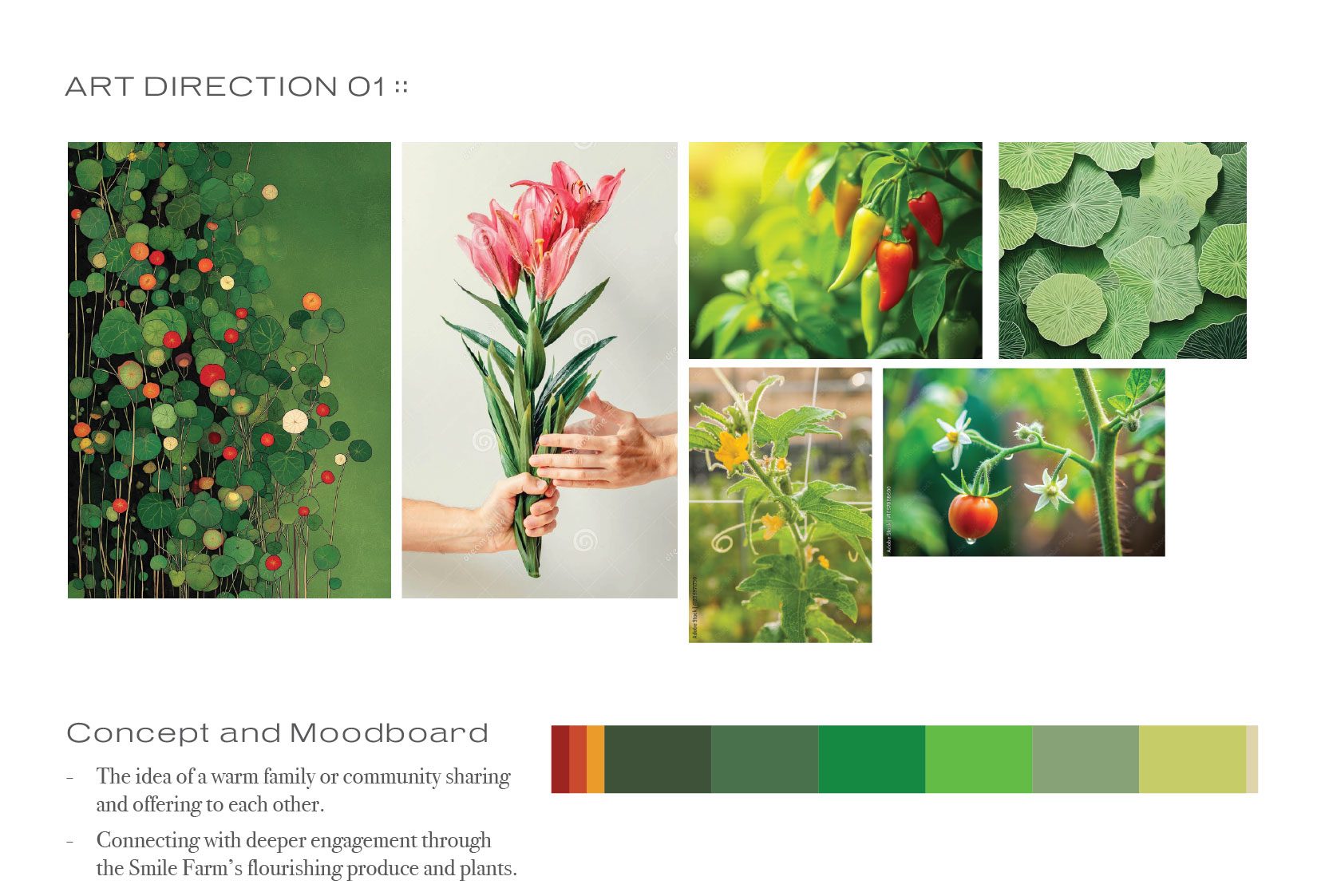
My round one moodboard: a community sharing and offering to each other, through the farm’s own produce and plants.
Brainstorming in Adobe FireflyIn my first Firefly session I made no layouts at all. I was looking for one gesture the whole night could carry. My thinking was that a gala for an organization about meaningful work should not open with a flower. It should open with a hand. I ran four generations across four seeds to test the grip, not the bouquet.
Next I ran sixteen passes from one prompt, in four seed families of four variations each, to work out a single botanical language.
The one rule I held across every pass was the roots. Each generation kept the soil and root system visible below the line, because that is the argument Smile Farms makes about growing people.
None of these frames shipped. They set the palette, the density and the horizon line that my final artwork had to answer to, and they got the team reacting to real images within days.
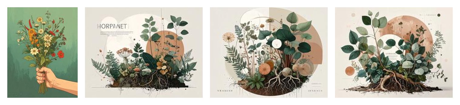
My Firefly exploration: the hand first, then sixteen passes to settle the botanical language with the roots in frame.
Work in progress on the Firefly boardI kept every pass on one shared Firefly board, titled Smile Farms Gala 2026. I used it like a studio wall. I deleted nothing, so each new round sat right next to the one before it and the comparison did the deciding.
The board grew into two clusters, one for each emerging direction. In the bouquet cluster I tested one hand gripping a bunch against two hands passing it, wildflowers against farm crops, and different pairings of skin tones, across more than a dozen full frames plus grids of variations. I put an early save-the-date banner right in the middle of it, so I was testing layout while the image was still moving.
The second cluster is the layered, painterly look that became Systems of Bloom. In it I set compositions inside soft circles, tried tall vertical arrangements, and put the same bouquet on cream, sage and deep green. I cut several frames out on transparent backgrounds to test whether a single plant could stand on its own. That question turned into the accent library.
At the end I brought the finished invitation back to the same board for staging, so the whole project, from first gesture to final table setting, reads on one canvas.
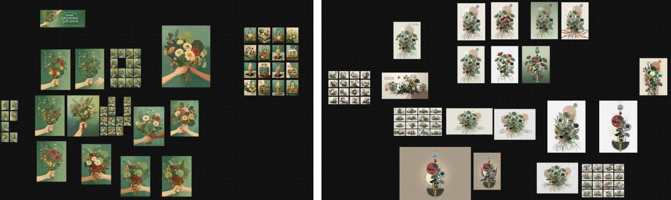
The bouquet cluster, left, and the Systems of Bloom cluster, right.
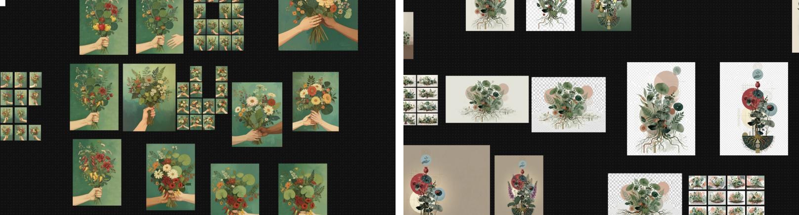
Up close, what I was testing: one hand or two, wildflowers or crops, and plants cut out as standalone accents.
Two directionsFor the first round I built two directions from that exploration. In Rooted to Share Bouquet, one hand offers a full, hand-gathered bouquet to another hand ready to receive it. I bundled squash blossoms, garden greens, farm-grown peppers, tomatoes, nasturtium leaves and ferns together against a deep teal-green field, to speak to harvest, generosity and connection.
For Systems of Bloom I took my cue from traditional Japanese botanical painting: a restrained palette, fine detail and quiet atmosphere, with layered plant forms sitting inside soft geometric fields. Here the roots carry a double meaning, the literal plant and the unseen network of support Smile Farms builds around each participant.
I gave each direction its own accent set and a working eVite, so the board could judge them as campaigns, not just pictures.
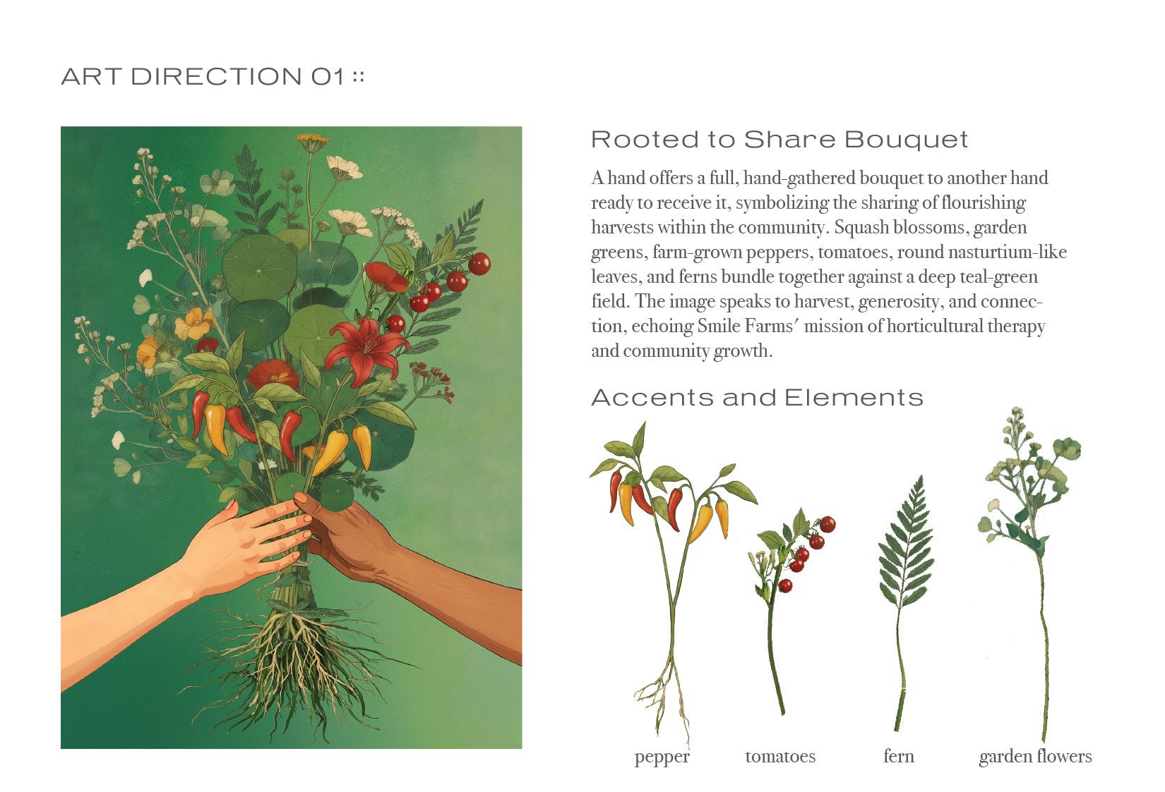
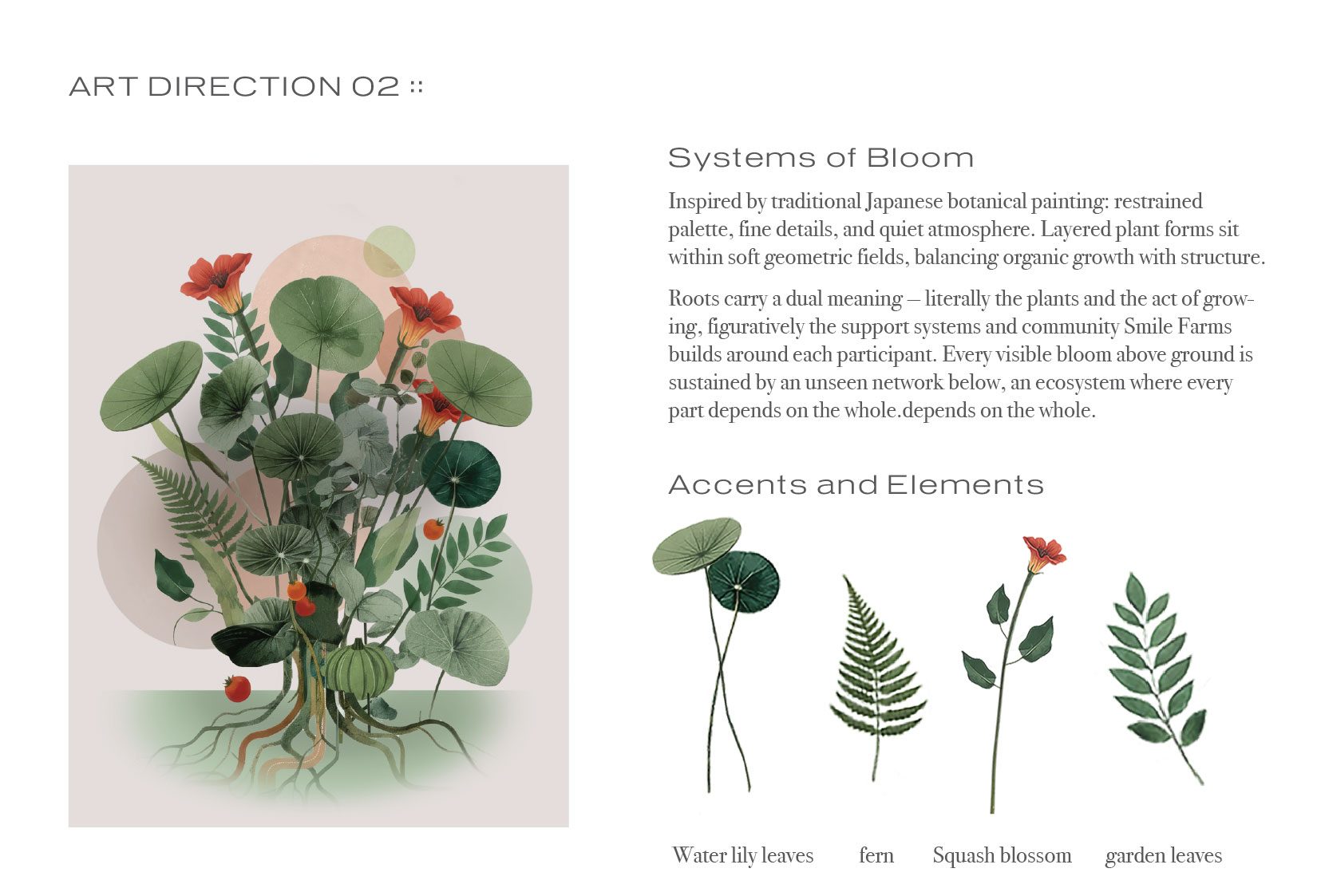
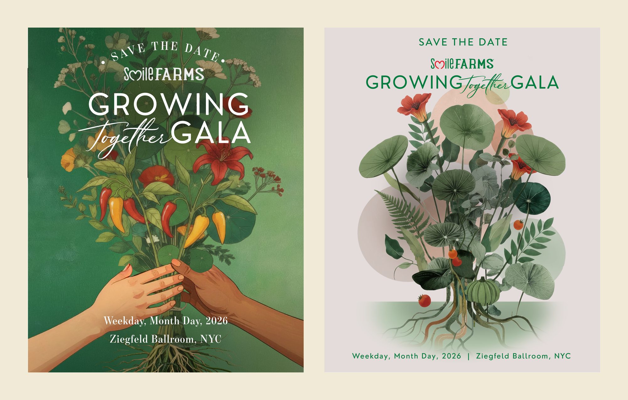
Round one eVites, side by side. Direction 01 moved forward.
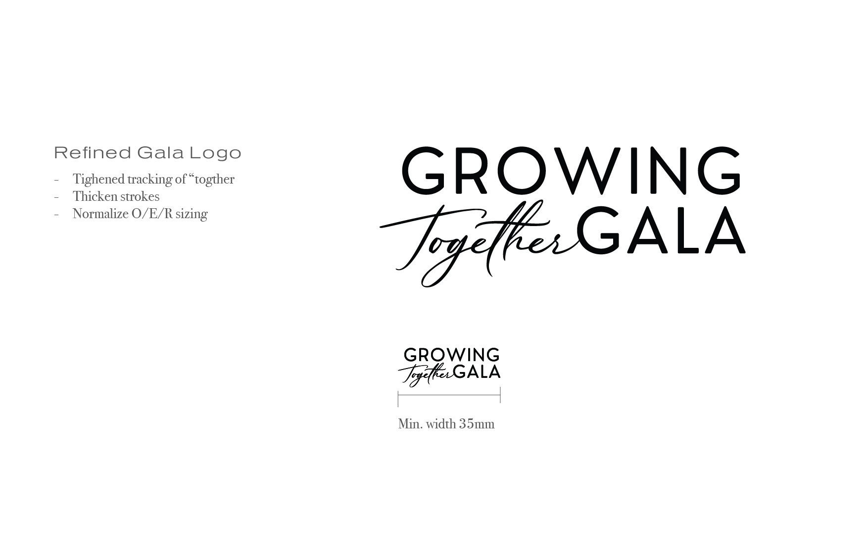
Refining the systemIn round two I refined the main visual, locked the palette and built out the type system. Alongside it, I tightened the gala lockup: closer tracking on “Together,” thicker strokes, normalized sizing on the O, E and R, and a 35mm minimum width so it holds up small.
I pulled the color system straight out of the illustration. Five greens carry the backgrounds. The warm reds, marigold and cream come from the peppers, tomatoes and lilies, and I saved them for moments that need to pop.
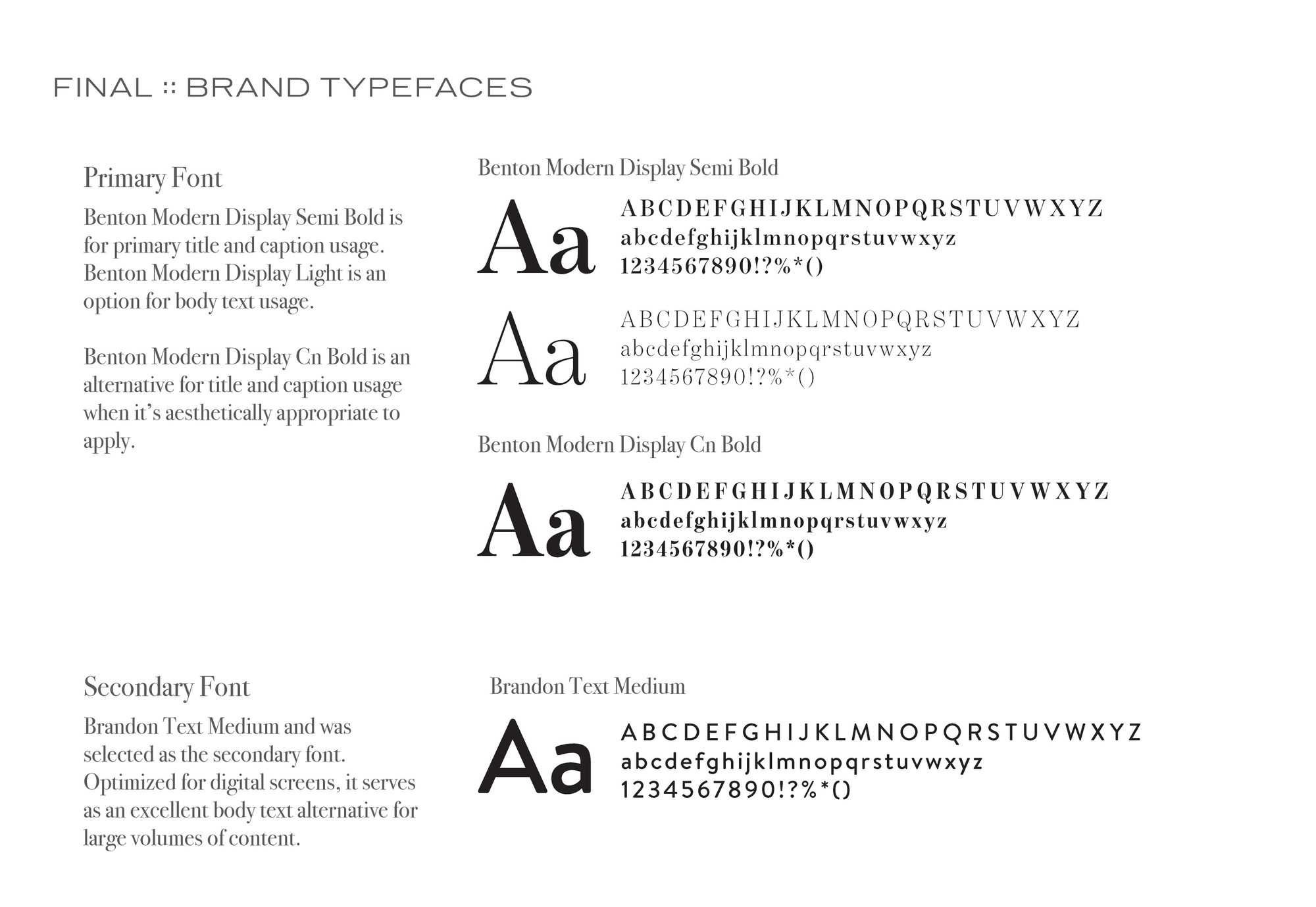
For type, I chose Benton Modern Display to give titles an elegant, evening-event feel, and Brandon Text to keep longer copy easy to read on screens.
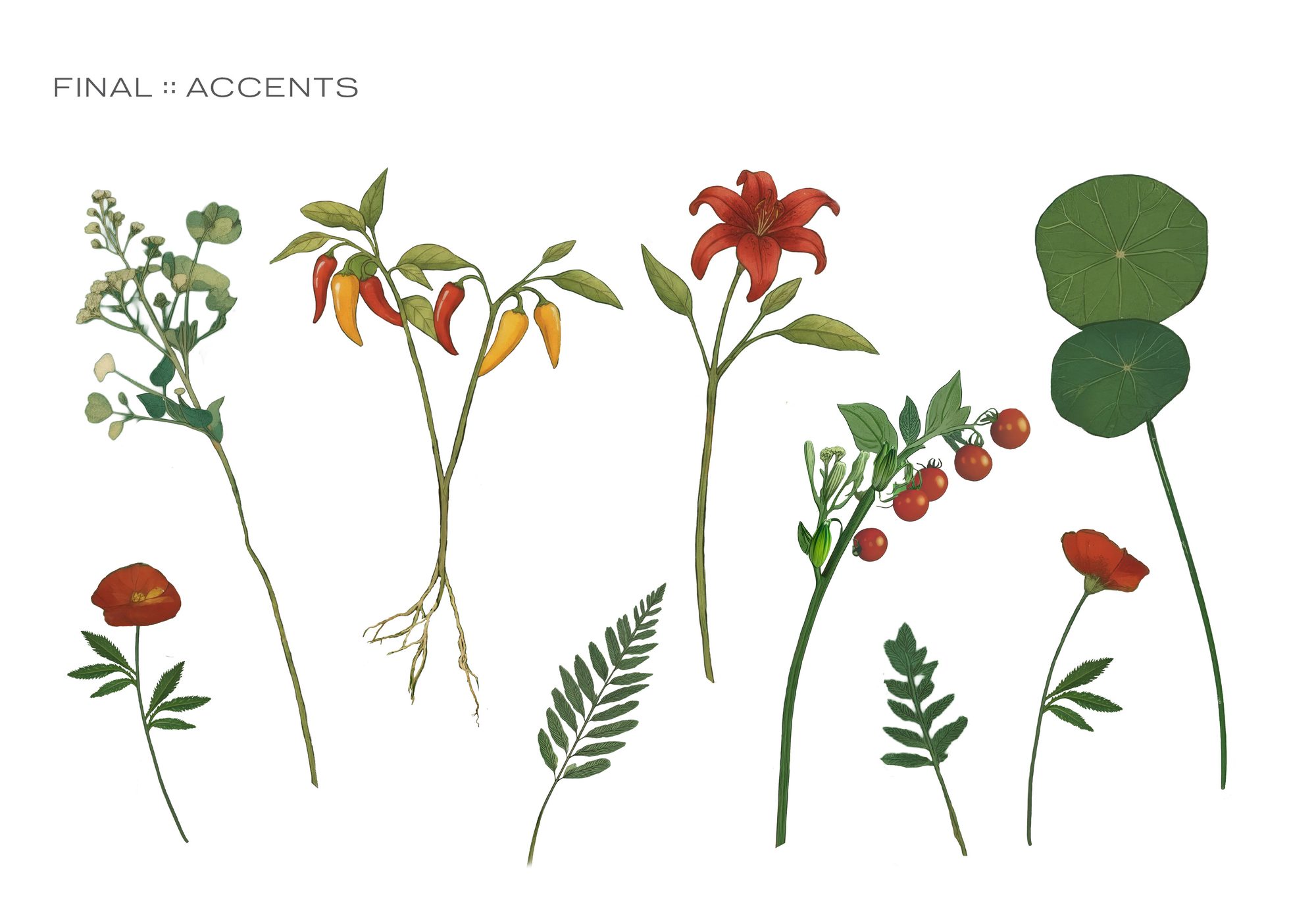
Then I broke the bouquet back down into single botanical accents. Each stem works alone, so the system can frame text on an invitation, fill a wide banner or sit quietly in a corner. The accents are my answer to the in-house problem: the team can extend the brand all season without new illustration.
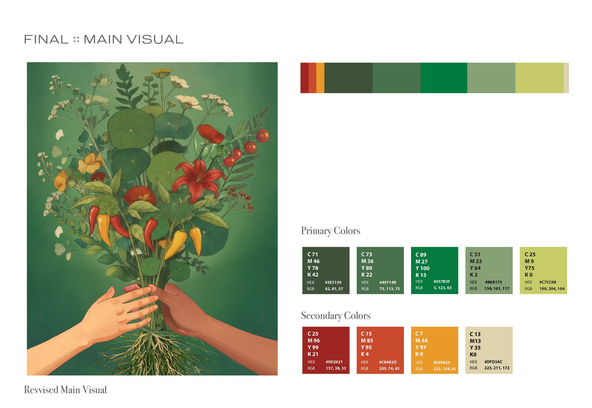
A system only scales if the people using it can get it right without a designer in the room. I matched every CMYK and HEX value from the brand palette into the team’s Canva brand kit, color by color, so anything the staff built that season would pull from the exact same nine colors.
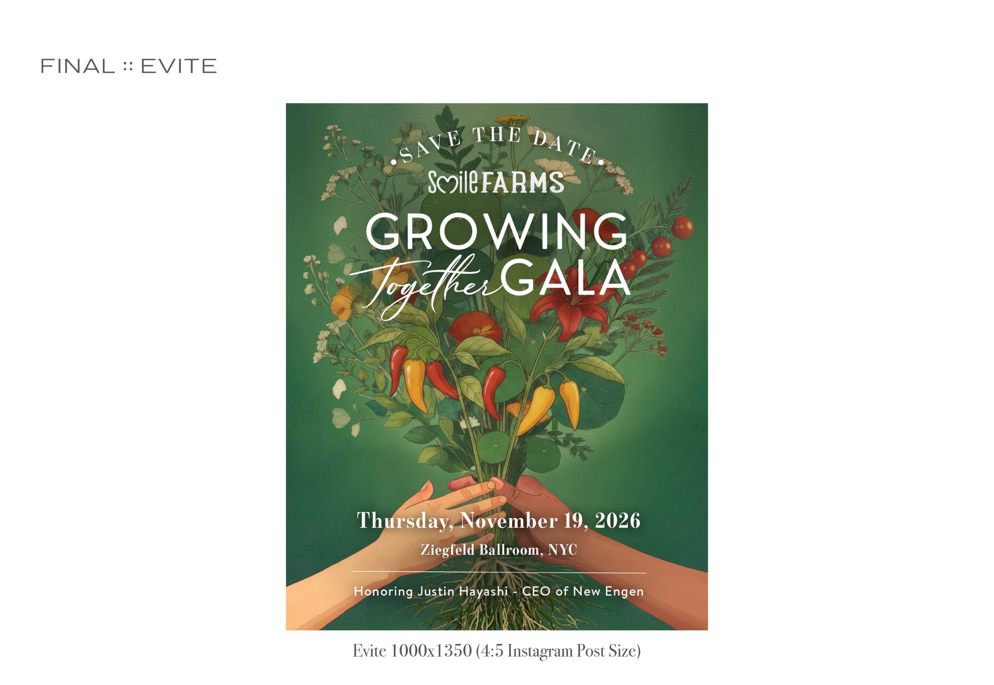
I launched the save-the-date as a 4:5 eVite sized for Instagram, with the bouquet front and center and the event details tucked under the hands.
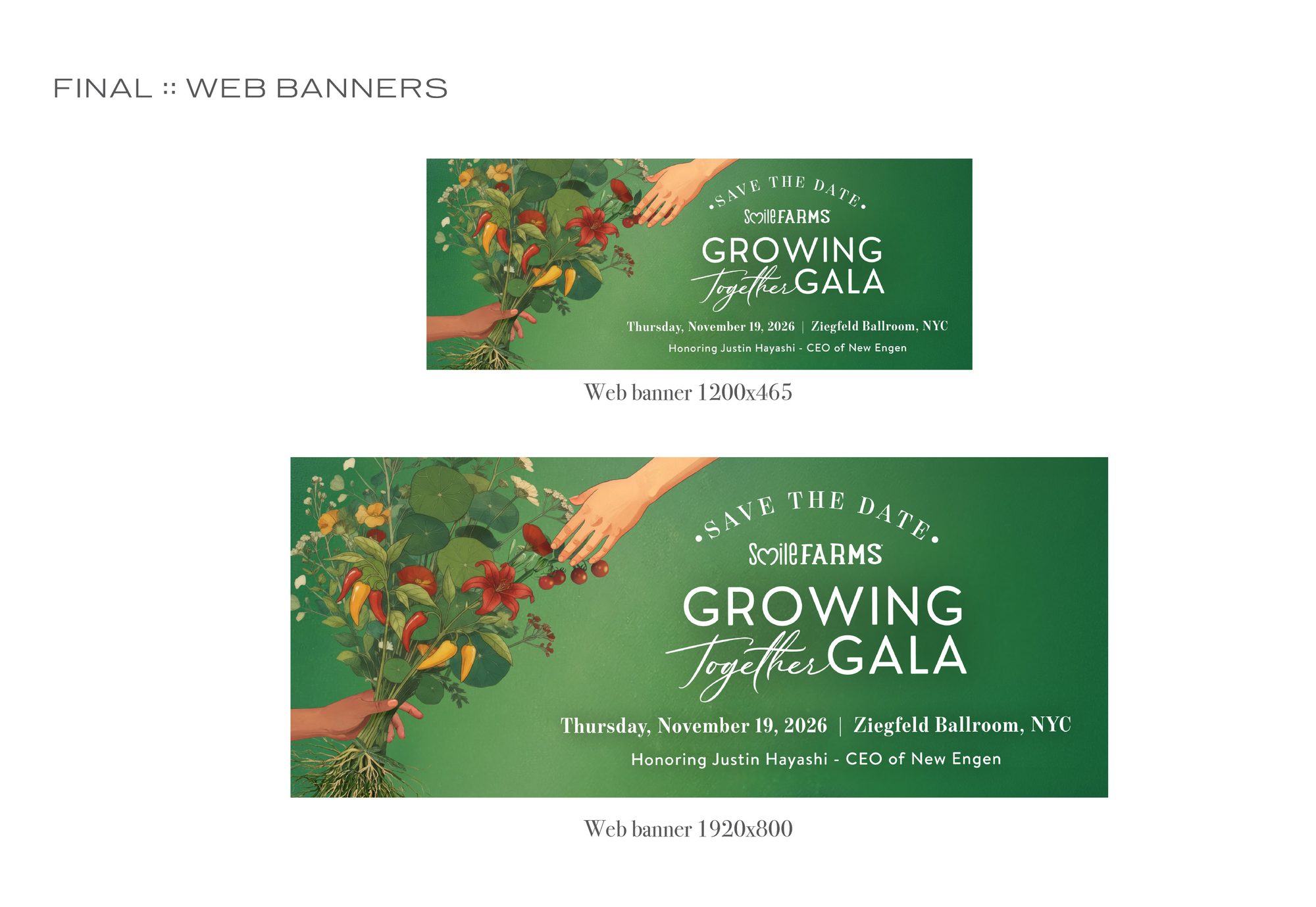
For the web, I reworked the composition for 1200 x 465 and 1920 x 800 banners. I stretched the hands across the frame so they reach toward the type, and the handoff still reads on a wide screen. The large banner now leads the gala page on smilefarms.org.
At the other end of the scale, I rebuilt the main visual as a 55 x 69 inch print file for the event itself. It is the same artwork running from a phone screen to a ballroom.
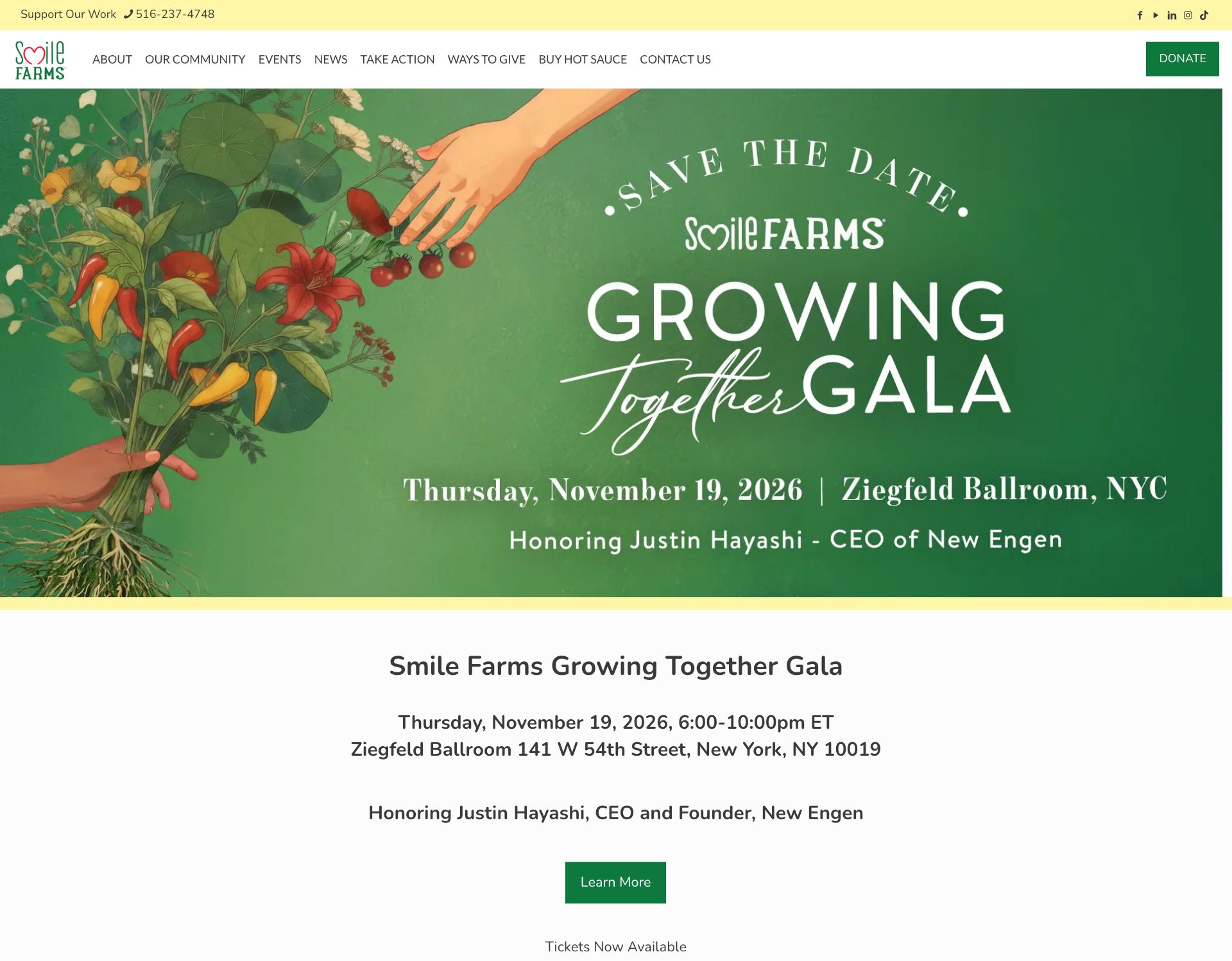
Live on smilefarms.org.
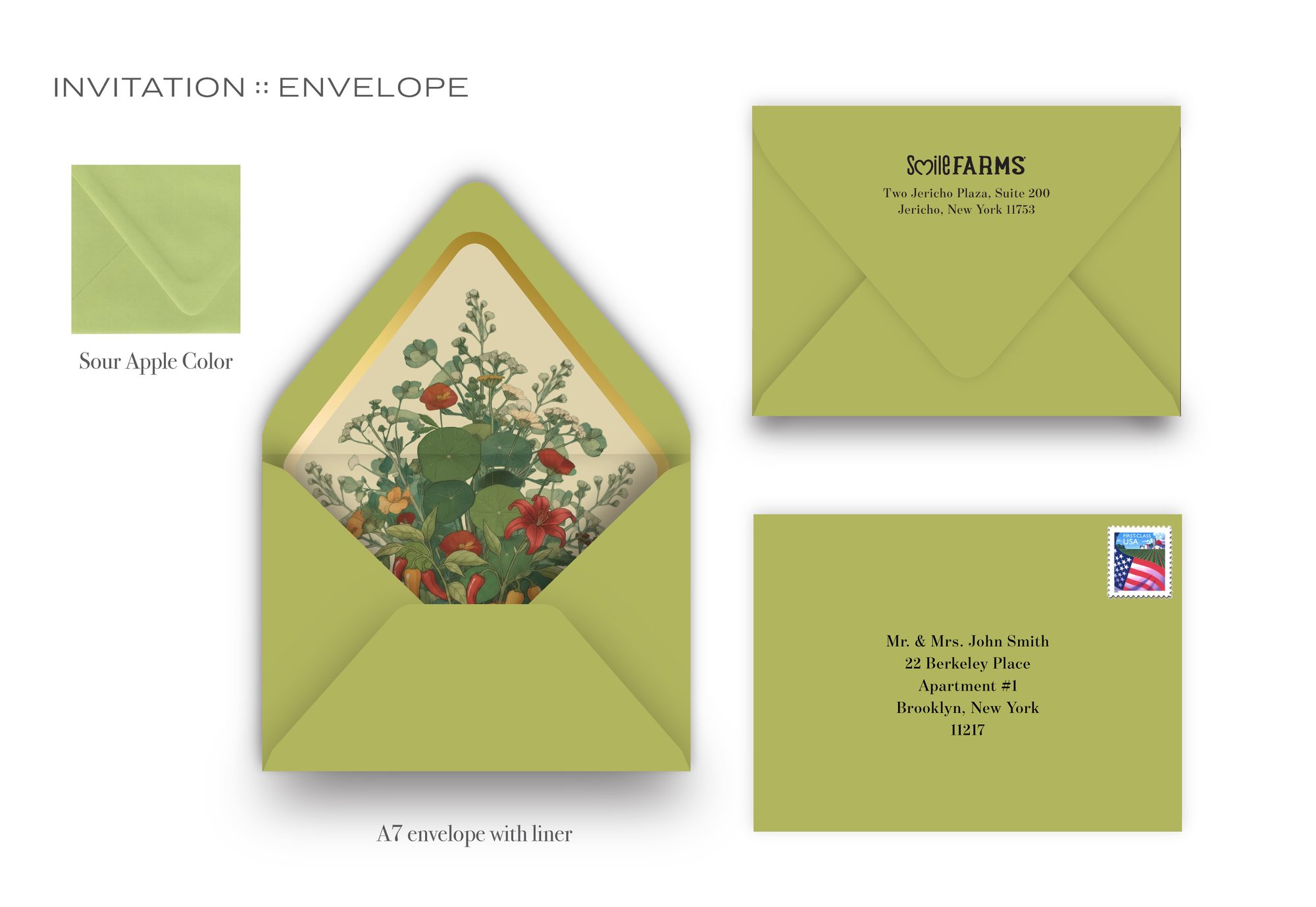
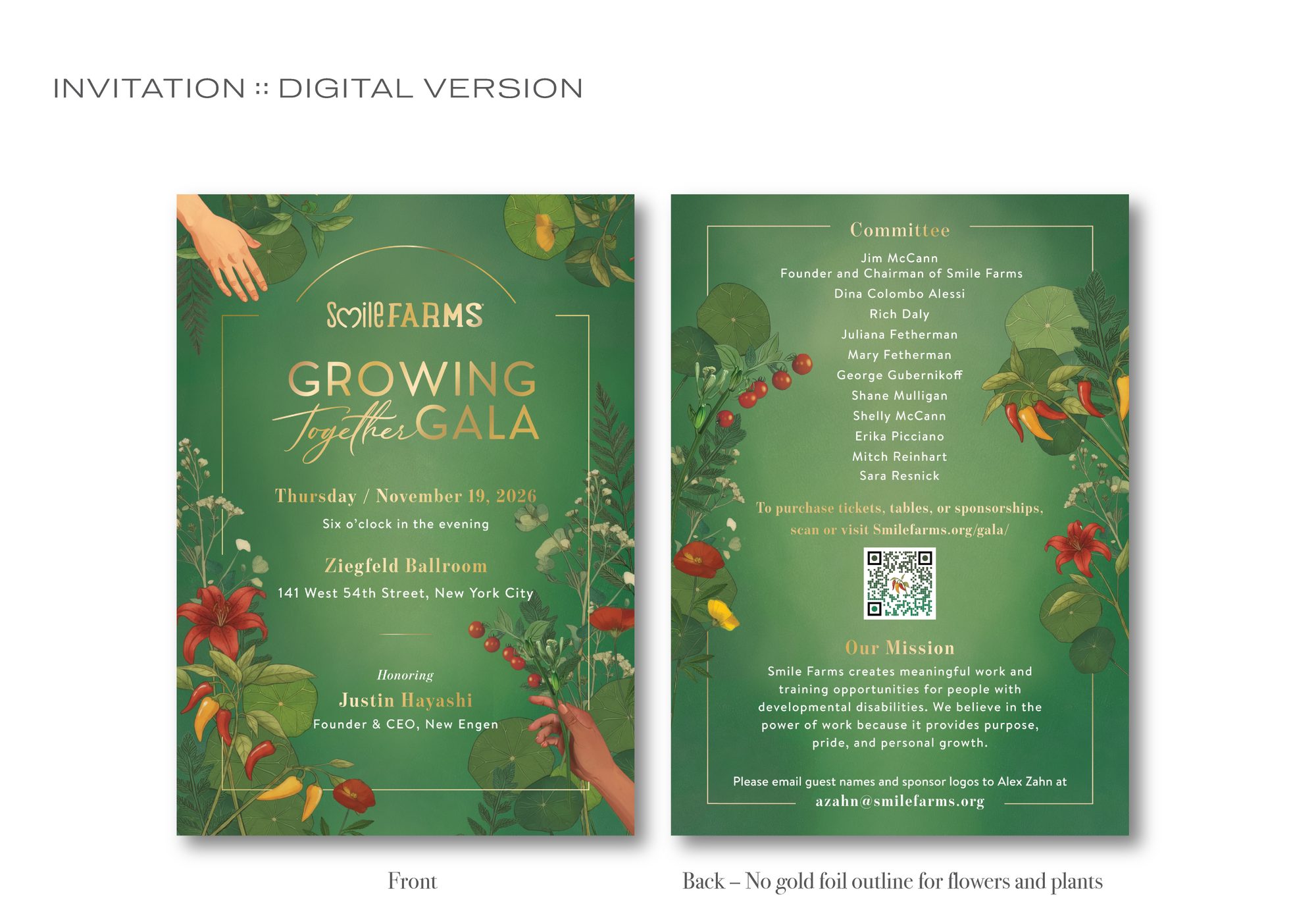
The invitation, as a set of decisionsIn phase two I carried the system into print: a 5 x 7 inch flat card, the envelope, two liner options and a digital version. Each page of my presentation answered a production question as much as a visual one.
Gold goes to the words on the front and the plants on the back. The client asked for flowers with gold stems, but I saw that on the front they would compete with the gold type, which matters most. So I kept gold for the text on the front and moved the botanicals to a gold outline on the back.
Flat foil instead of raised foil. The serif hairlines were set at 0.5 pt, and the printer recommends 1 pt as the minimum for raised foil because fine lines spread. Flat foil let me keep the text in gold without losing the hairlines.
Sour Apple A7 with a euro flap. Chartreuse was sold out at the main suppliers, and the one remaining source printed the color onto white stock, which I felt would read less premium. So I chose Sour Apple to keep the color story on real colored paper.
Two liners, priced against each other. Option one puts the bouquet on cream with metallic gold ink. Option two, a mirror gold liner, was my fallback if the ink upgrade did not fit the budget.
The digital invite drops the gold outline. In print, foil catches the light and the outline reads as luxurious. On screen it reads as a thin yellow line, so I removed it from the digital back.
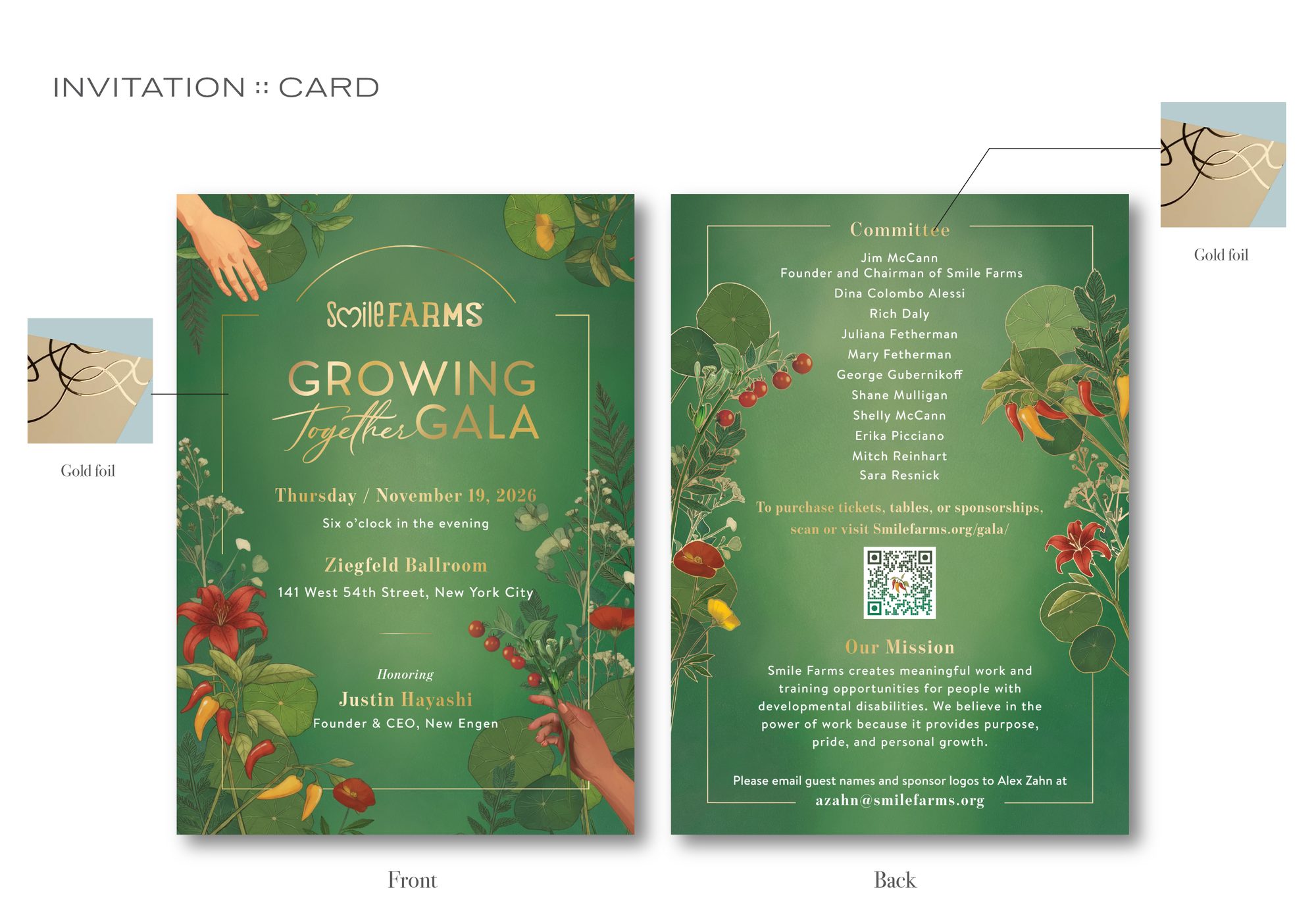
Gold foil mapped to type on the front and to the botanical outline on the back.
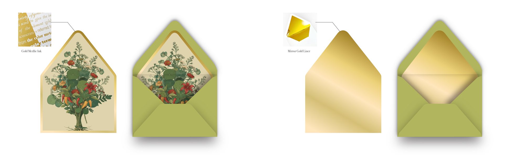
Liner option one, metallic gold ink, and option two, mirror gold.
Firefly came back at the end of the project with a different job. Rather than book a mockup shoot, I fed the approved card into Firefly as a reference image, with instructions to place it, not redraw it.
In one evening session I ran seven passes, a few minutes apart. Seeing the bouquet liner next to the plain gold one, in a real-looking setting, made the case for liner option one faster than any spec sheet could.
Then I sent nine prompts in at once, holding the subject steady and changing only the lens, the hour and the mood. I wrote it as a photo brief, the way a director talks to a photographer, so the client could picture the invitation on the table on the night.
Firefly earned its place at both ends for me: finding a visual argument fast, and staging finished work in rooms no shoot was budgeted for. Everything in between, from deciding the roots mattered to every foil, paper and liner call, was my design judgment.
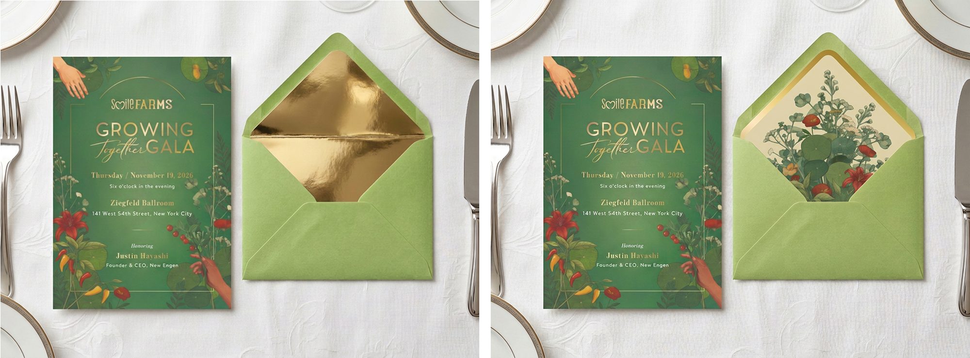
Same card, two liners, five minutes apart.
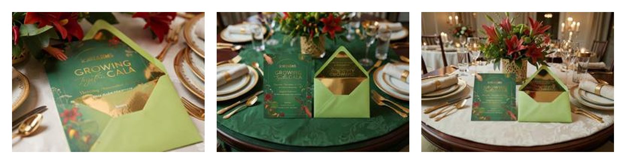
Nine cameras, one table. Macro, shallow depth and intimate mood.
ResultThe suite printed with flat gold foil and went out to the guest list ahead of the gala. I delivered one concept that runs from a phone screen to a 55 x 69 inch print, with an accent library and Canva brand kit so the in-house team can keep building on-brand all season.
On the liner presentation, the event producer wrote: “Love the liner design with the cream background and bouquet -- I think the planner will feel like this is the elevated-formal feel they're going for. Really lovely!”
“Thank you! They are just gorgeous - I've heard they've been getting really positive feedback on the save the date!”